# load required library
library(tidyverse)
library(colorspace)

temperatures <- read_csv("https://wilkelab.org/SDS375/datasets/tempnormals.csv") %>%
  mutate(
    location = factor(
      location, levels = c("Death Valley", "Houston", "San Diego", "Chicago")
    )
  ) %>%
  select(location, day_of_year, month, temperature)

temps_months <- read_csv("https://wilkelab.org/SDS375/datasets/tempnormals.csv") %>%
  group_by(location, month_name) %>%
  summarize(mean = mean(temperature)) %>%
  mutate(
    month = factor(
      month_name,
      levels = c("Jan", "Feb", "Mar", "Apr", "May", "Jun", "Jul", "Aug", "Sep", "Oct", "Nov", "Dec")
    ),
    location = factor(
      location, levels = c("Death Valley", "Houston", "San Diego", "Chicago")
    )
  ) %>%
select(-month_name)Customizing data visualizations using colorspace, ggplot2, and patchwork
Learn how to change ggplot’s default choices for color and style and take control of final figure presentation.
Color Scales
Coding exercise 7.1
In this worksheet, we will discuss how to change and customize color scales.
We will be using the R package tidyverse, which includes ggplot() and related functions. We will also be using the R package colorspace for the scale functions it provides.
We will be working with the dataset temperatures that we have used in previous worksheets. This dataset contains the average temperature for each day of the year for four different locations.
temperatures# A tibble: 1,464 × 4
location day_of_year month temperature
<fct> <dbl> <chr> <dbl>
1 Death Valley 1 01 51
2 Death Valley 2 01 51.2
3 Death Valley 3 01 51.3
4 Death Valley 4 01 51.4
5 Death Valley 5 01 51.6
6 Death Valley 6 01 51.7
7 Death Valley 7 01 51.9
8 Death Valley 8 01 52
9 Death Valley 9 01 52.2
10 Death Valley 10 01 52.3
# ℹ 1,454 more rowsWe will also be working with an aggregated version of this dataset called temps_months, which contains the mean temperature for each month for the same locations.
temps_months# A tibble: 48 × 3
# Groups: location [4]
location mean month
<fct> <dbl> <fct>
1 Chicago 50.4 Apr
2 Chicago 74.1 Aug
3 Chicago 29 Dec
4 Chicago 28.9 Feb
5 Chicago 24.8 Jan
6 Chicago 75.8 Jul
7 Chicago 71.0 Jun
8 Chicago 38.8 Mar
9 Chicago 60.9 May
10 Chicago 41.6 Nov
# ℹ 38 more rowsAs a challenge, try to create this above table yourself using group_by() and summarize() like we learned about Wednesday., and then make a month column which is a factor with levels froing from “Jan” to “Dec”, and make the location column a factor with levels “Death Valley”, “Houston”, “San Diego”, “Chicago”. If you are having trouble, the solution is at the end of this page, make sure you copy it into your code so the rest of the exercise works.
# check solution at the end before moving on!
temps_months <- read_csv("https://wilkelab.org/SDS375/datasets/tempnormals.csv") %>%
  group_by(___) %>%
  summarize(___) %>%
  mutate(
    month = factor(
      month_name,
      ___
    ),
    location = factor(
      location, ___
    )
  ) %>%
  select(-month_name)
Built in ggplot2 color scales
We will start with built-in ggplot2 color scales, which require no additional packages. The scale functions are always named scale_color_*() or scale_fill_*(), depending on whether they apply to the color or fill aesthetic. The * indicates some other words specifying the type of the scale, for example scale_color_brewer() or scale_color_distiller() for discrete or continuous scales from the ColorBrewer project, respectively. You can find all available built-in scales here: https://ggplot2.tidyverse.org/reference/index.html#section-scales
Now consider the following plot.
ggplot(temps_months, aes(x = month, y = location, fill = mean)) +
  geom_tile() +
  coord_fixed(expand = FALSE)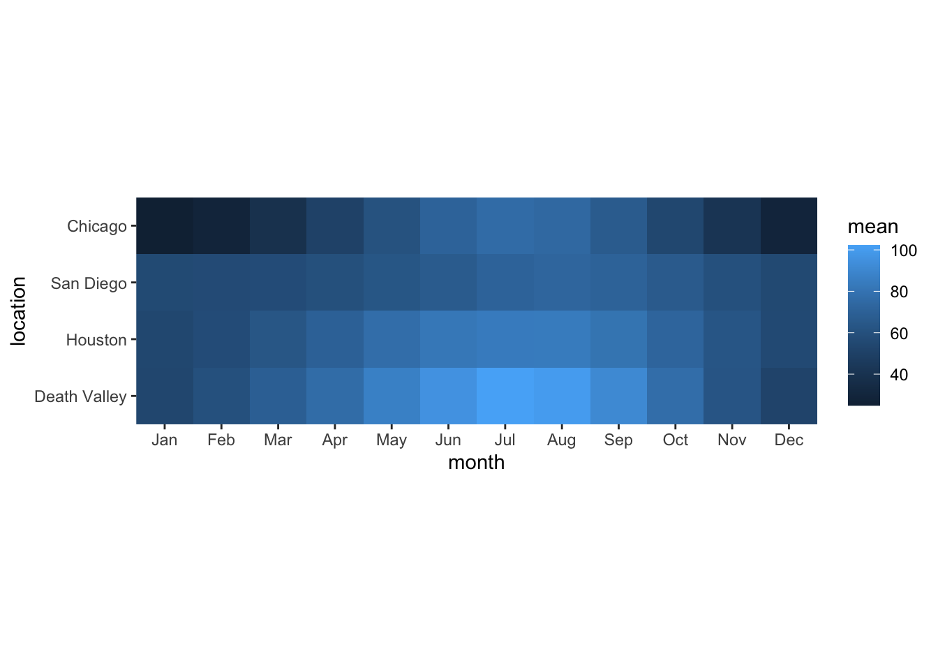
If you wanted to change the color scale to one from the ColorBrewer project, which scale function would you have to add? scale_color_brewer(), scale_color_distiller(), scale_fill_brewer(), scale_fill_distiller()?
# answer the question above to yourselfNow try this out.
ggplot(temps_months, aes(x = month, y = location, fill = mean)) +
  geom_tile() +
  coord_fixed(expand = FALSE) +
  ___
Most color scale functions have additional customizations. How to use them depends on the specific scale function. For the ColorBrewer scales you can set direction = 1 or direction = -1 to set the direction of the scale (light to dark or dark to light). You can also set the palette via a numeric argument, e.g. palette = 1, palette = 2, palette = 3 etc.
Try this out by setting the direction of the scale from light to dark and using palette #4.
# build all the code for this exerciseA popular set of scales are the viridis scales, which are provided by scale_*_viridis_c() for continuous data and scale_*_viridis_d() for discrete data. Change the above plot to use a viridis scale.
# build all the code for this exerciseThe viridis scales can be customized with direction (as before), option (which can be "A", "B", "C", "D", or "E"), and begin and end which are numerical values between 0 and 1 indicating where in the color scale the data should begin or end. For example, begin = 0.2 means that the lowest data value is mapped to the 20th percentile in the scale.
Try different choices for option, begin, and end to see how they change the plot.
# build all the code for this exerciseCustomizing scale title and labels
In a previous worksheet, we used arguments such as name, breaks, labels, and limits to customize the axis. For color scales, instead of an axis we have a legend, and we can use the same arguments inside the scale function to customize how the legend looks.
Try this out. Set the scale limits from 10 to 110 and set the name of the scale and the breaks as you wish.
ggplot(temps_months, aes(x = month, y = location, fill = mean)) +
  geom_tile() +
  coord_fixed(expand = FALSE) +
  scale_fill_viridis_c(
    name = ___,
    breaks = ___,
    limits = ___
  )
Note: Color scales ignore the expand argument, so you cannot use it to expand the scale beyond the data values as you can for position scales.
Binned scales
Research into human perception has shown that continuous coloring can be difficult to interpret. Therefore, it is often preferable to use a small number of discrete colors to indicate ranges of data values. You can do this in ggplot with binned scales. For example, scale_fill_viridis_b() provides a binned version of the viridis scale. Try this out.
ggplot(temps_months, aes(x = month, y = location, fill = mean)) +
  geom_tile() +
  coord_fixed(expand = FALSE) +
  ___
You can change the number of bins by providing the n.breaks argument or alternatively by setting breaks explicitly. Try this out.
# build all the code for this exerciseScales from the colorspace package
The color scales provided by the colorspace package follow a simple naming scheme of the form scale_<aesthetic>_<datatype>_<colorscale>(), where <aesthetic> is the name of the aesthetic (fill, color, colour), <datatype> indicates the type of variable plotted (discrete, continuous, binned), and colorscale stands for the type of the color scale (qualitative, sequential, diverging, divergingx).
For the mean temperature plot we have been using throughout this worksheet, which 2 color scales from the colorspace package is/are appropriate?
scale_fill_binned_sequential(), scale_fill_discrete_qualitative(), scale_fill_continuous_sequential(), scale_color_continuous_sequential(), scale_color_continuous_diverging()>
ggplot(temps_months, aes(x = month, y = location, fill = mean)) +
  geom_tile() +
  coord_fixed(expand = FALSE) +
  ___
You can customize the colorspace scales with the palette argument, which takes the name of a palette (e.g., "Inferno", "BluYl", "Lajolla"). Try this out. Also try reversing the scale direction with rev = TRUE or rev = FALSE. (The colorspace scales use rev instead of direction.) You can find the names of all supported scales here (consider specifically single-hue and multi-hue sequential palettes).
# build all the code for this exerciseYou can also use begin and end just like in the viridis scales.
Manual scales
For discrete data with a small number of categories, it’s usually best to set colors manually. This can be done with the scale functions scale_*_manual(). These functions take an argument values that specifies the color values to use.
To see how this works, let’s go back to this plot of temperatures over time for four locations.
ggplot(temperatures, aes(day_of_year, temperature, color = location)) +
  geom_line(size = 1.5)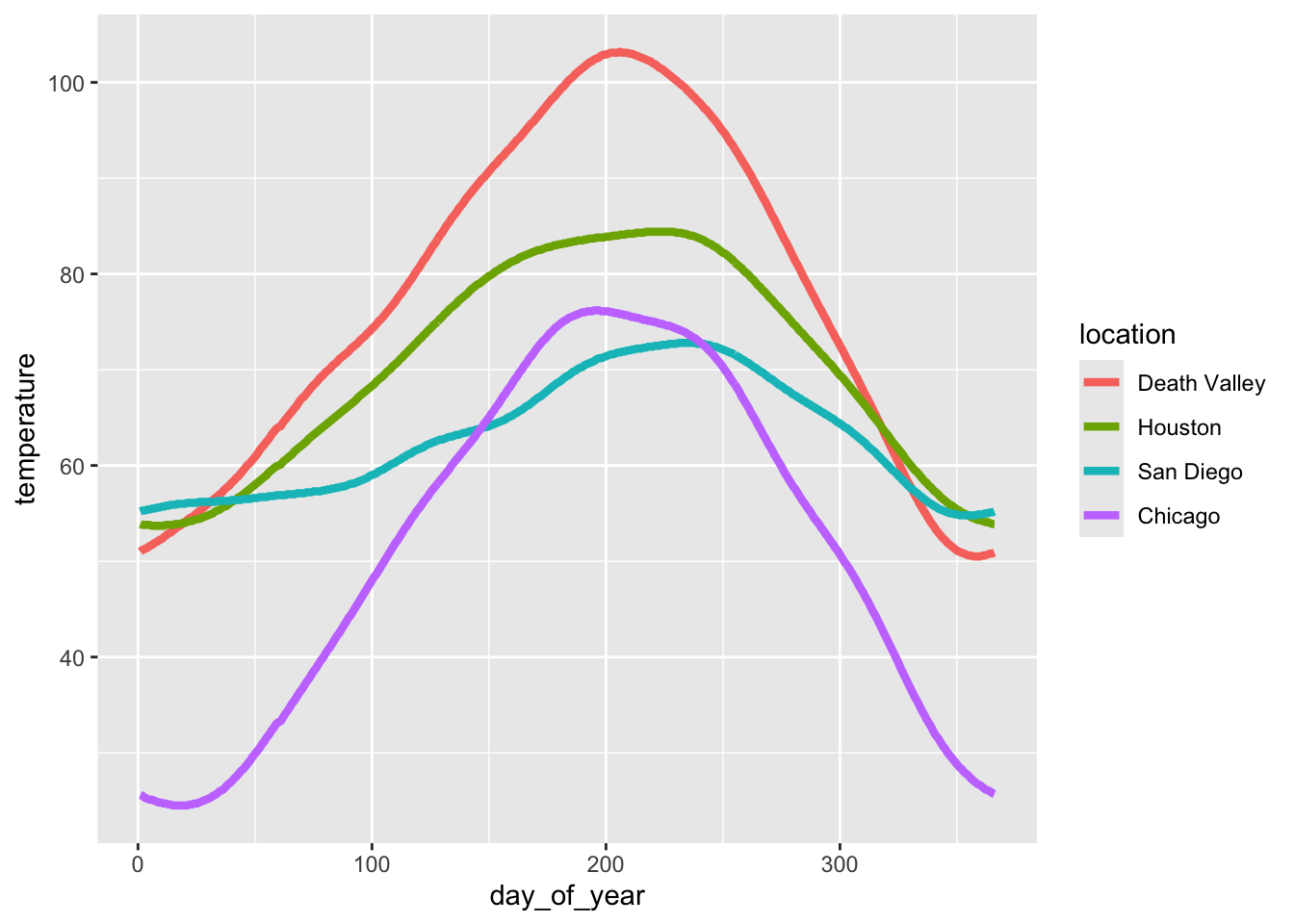
Let’s use the following four colors: "gold2", "firebrick", "blue3", "springgreen4". We can visualize this palette using the function swatchplot() from the colorspace package.
colorspace::swatchplot(c("gold2", "firebrick", "blue3", "springgreen4"))
Now apply this color palette to the temperatures plot, by using the manual color scale. Hint: use the values argument to provide the colors to the manual scale.
ggplot(temperatures, aes(day_of_year, temperature, color = location)) +
  geom_line(size = 1.5) +
  ___
One problem with this approach is that we can’t easily control which data value gets assigned to which color. What if we wanted San Diego to be shown in green and Chicago in blue? The simplest way to resolve this issue is to use a named vector. A named vector in R is a vector where each value has a name. Named vectors are created by writing c(name1 = value1, name2 = value2, ...). See the following example.
# regular vector
c("cat", "mouse", "house")
[1] "cat" "mouse" "house"# named vector
c(A = "cat", B = "mouse", C = "house") A B C
"cat" "mouse" "house" The names in the second example are A, B, and C. Notice that the names are not in quotes. However, if you need a name containing a space (such as Death Valley), you need to enclose the name in backticks. Thus, our named vector of colors could be written like so:
c(`Death Valley` = "gold2", Houston = "firebrick", Chicago = "blue3", `San Diego` = "springgreen4") Death Valley Houston Chicago San Diego
"gold2" "firebrick" "blue3" "springgreen4" Now try to use this color vector in the figure showing temperatures over time.
# build all the code for this exerciseTry some other colors also. For example, you could use the Okabe-Ito colors:
# Okabe-Ito colors
colorspace::swatchplot(c("#E69F00", "#56B4E9", "#009E73", "#F0E442", "#0072B2", "#D55E00", "#CC79A7", "#000000"))
Alternatively, you can find a list of all named colors here. You can also run the command colors() in your R console to get a list of all available color names.
Hint: It’s a good idea to never use the colors "red", "green", "blue", "cyan", "magenta", "yellow". They are extreme points in the RGB color space and tend to look unnatural and too crazy. Try this by making a swatch plot of these colors, and compare for example to the color scale containing the colors "firebrick", "springgreen4", "blue3", "turquoise3", "darkorchid2", "gold2". Do you see the difference?
# build all the code for this exerciseSolution to the challenge to make the summary table of mean temperature by month:
# paste this below the "temperatures" code-chunk
temps_months <- read_csv("https://wilkelab.org/SDS375/datasets/tempnormals.csv") %>%
  group_by(location, month_name) %>%
  summarize(mean = mean(temperature)) %>%
  mutate(
    month = factor(
      month_name,
      levels = c("Jan", "Feb", "Mar", "Apr", "May", "Jun", "Jul", "Aug", "Sep", "Oct", "Nov", "Dec")
    ),
    location = factor(
      location, levels = c("Death Valley", "Houston", "San Diego", "Chicago")
    )
  ) %>%
select(-month_name)Figure Design
Coding exercise 7.2
In this worksheet, we will discuss how to change and customize themes.
We will be using the R package tidyverse, which includes ggplot() and related functions. We will also be using the packages cowplot for themes and the package palmerpenguins for the penguins dataset.
# load required library
library(tidyverse)
library(cowplot)
library(palmerpenguins)
We will be working with the dataset penguins containing data on individual penguins on Antarctica.
penguins# A tibble: 344 × 8
species island bill_length_mm bill_depth_mm flipper_length_mm body_mass_g
<fct> <fct> <dbl> <dbl> <int> <int>
1 Adelie Torgersen 39.1 18.7 181 3750
2 Adelie Torgersen 39.5 17.4 186 3800
3 Adelie Torgersen 40.3 18 195 3250
4 Adelie Torgersen NA NA NA NA
5 Adelie Torgersen 36.7 19.3 193 3450
6 Adelie Torgersen 39.3 20.6 190 3650
7 Adelie Torgersen 38.9 17.8 181 3625
8 Adelie Torgersen 39.2 19.6 195 4675
9 Adelie Torgersen 34.1 18.1 193 3475
10 Adelie Torgersen 42 20.2 190 4250
# ℹ 334 more rows
# ℹ 2 more variables: sex <fct>, year <int>Ready-made themes
Let’s start with this simple plot with no specific styling.
ggplot(penguins, aes(flipper_length_mm, body_mass_g, color = species)) +
  geom_point(na.rm = TRUE)  # na.rm = TRUE prevents warning about missing values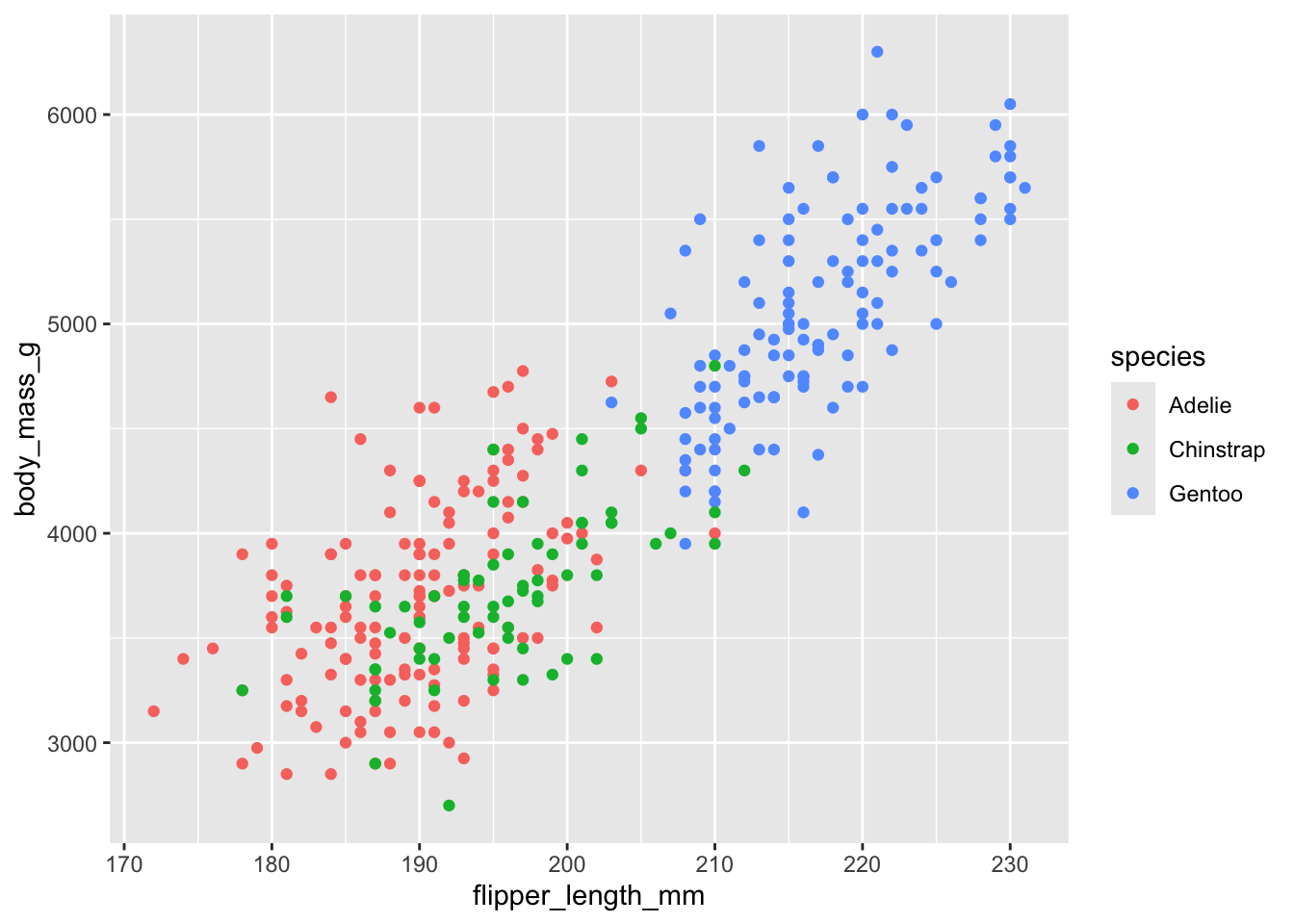
The default ggplot theme is theme_gray(). Verify that adding this theme to the plot makes no difference in the output. Then change the overall font size by providing the theme function with a numeric font size argument, e.g. theme_gray(16).
ggplot(penguins, aes(flipper_length_mm, body_mass_g, color = species)) +
  geom_point(na.rm = TRUE) +
  ___
The ggplot2 package has many built-in themes, including theme_minimal(), theme_bw(), theme_void(), theme_dark(). Try these different themes on the above plot. Also try again changing the font size. You can see all themes provided by ggplot2 here: https://ggplot2.tidyverse.org/reference/ggtheme.html
# build all the code for this exerciseMany other packages also provide themes. For example, the cowplot package provides themes theme_half_open(), theme_minimal_grid(), theme_minimal_hgrid(), and theme_minimal_vgrid(). You can see all cowplot themes here: https://wilkelab.org/cowplot/articles/themes.html
# build all the code for this exerciseCompare the visual appearance of theme_minimal() from ggplot2 to theme_minimal_grid() from cowplot. What similarities and differences to you notice? Which do you prefer? (There is no correct answer here, just be aware of the differences and of your preferences.)
# build all the code for this exerciseModifying theme elements
You can modify theme elements by adding a theme() call to the plot. Inside the theme() call you specify which theme element you want to modify (e.g., axis.title, axis.text.x, panel.background, etc) and what changes you want to make. For example, to make axis titles blue, you would write:
theme(
  axis.title = element_text(color = "blue")
)
There are many theme settings, and for each one you need to know what type of an element it is (element_text(), element_line(), element_rect() for text, lines, or rectangles, respectively). A complete description of the available options is available at the ggplot2 website: https://ggplot2.tidyverse.org/reference/theme.html
Here, we will only try a few simple things. For example, see if you can make the legend title blue and the legend text red.
# make the legend title blue and the legend text red
ggplot(penguins, aes(flipper_length_mm, body_mass_g, color = species)) +
  geom_point(na.rm = TRUE)
Now color the area behind the legend in "aliceblue". Hint: The theme element you need to change is called legend.background. There is also an element legend.box.background but it is only visible if legend.background is not shown, and in the default ggplot2 themes that is not the case.
# build all the code for this exerciseAnother commonly used feature in themes are margins. Many parts of the plot theme can understand customized margins, which control how much spacing there is between different parts of a plot. Margins are typically specified with the function margin(), which takes four numbers specifying the margins in points, in the order top, right, bottom, left. So, margin(10, 5, 5, 10) would specify a top margin of 10pt, a right margin of 5pt, a bottom margin of 5pt, and a left margin of 10pt.
Try this out by setting the legend margin (element legend.margin) such that there is no top and no bottom margin but 10pt left and right margin.
# build all the code for this exerciseThere are many other things you can do. Try at least some of the following:
- Change the horizontal or vertical justification of text with
hjustandvjust. - Change the font family with
family.1 - Change the panel grid. For example, create only horizontal lines, or only vertical lines.
- Change the overall margin of the plot with
plot.margin. - Move the position of the legend with
legend.positionandlegend.justification. - Turn off some elements by setting them to
element_blank().
1 Getting fonts to work well can be tricky in R. Which specific fonts work depends on the graphics device and the operating system. You can try some of the following fonts and see if they work on app.terra.bio: "Palatino", "Times", "Helvetica", "Courier", "ITC Bookman", "ITC Avant Garde Gothic", "ITC Zapf Chancery".
Writing your own theme
You can write a theme by
theme_colorful <-
  theme_bw() +
  theme(
    text = element_text(color = "mediumblue"),
    axis.text = element_text(color = "springgreen4"),
    legend.text = element_text(color = "firebrick4")
  )
Hint: Do you have to add theme_colorful or theme_colorful()? Do you understand which option is correct and why? If you are unsure, try both and see what happens.
# build all the code for this exerciseNow write your own theme and then add it to the penguing plot.
# build all the code for this exerciseCompound Figures
Coding exercise 7.3
In this worksheet, we will discuss how to combine several ggplot2 plots into one compound figure.
We will be using the R package tidyverse, which includes ggplot() and related functions. We will also be using the package patchwork for plot composition.
# load required library
library(tidyverse)
library(patchwork)
We will be working with the dataset mtcars, which contains fuel consumption and 10 aspects of automobile design and performance for 32 automobiles (1973–74 models).
mtcars mpg cyl disp hp drat wt qsec vs am gear carb
Mazda RX4 21.0 6 160.0 110 3.90 2.620 16.46 0 1 4 4
Mazda RX4 Wag 21.0 6 160.0 110 3.90 2.875 17.02 0 1 4 4
Datsun 710 22.8 4 108.0 93 3.85 2.320 18.61 1 1 4 1
Hornet 4 Drive 21.4 6 258.0 110 3.08 3.215 19.44 1 0 3 1
Hornet Sportabout 18.7 8 360.0 175 3.15 3.440 17.02 0 0 3 2
Valiant 18.1 6 225.0 105 2.76 3.460 20.22 1 0 3 1
Duster 360 14.3 8 360.0 245 3.21 3.570 15.84 0 0 3 4
Merc 240D 24.4 4 146.7 62 3.69 3.190 20.00 1 0 4 2
Merc 230 22.8 4 140.8 95 3.92 3.150 22.90 1 0 4 2
Merc 280 19.2 6 167.6 123 3.92 3.440 18.30 1 0 4 4
Merc 280C 17.8 6 167.6 123 3.92 3.440 18.90 1 0 4 4
Merc 450SE 16.4 8 275.8 180 3.07 4.070 17.40 0 0 3 3
Merc 450SL 17.3 8 275.8 180 3.07 3.730 17.60 0 0 3 3
Merc 450SLC 15.2 8 275.8 180 3.07 3.780 18.00 0 0 3 3
Cadillac Fleetwood 10.4 8 472.0 205 2.93 5.250 17.98 0 0 3 4
Lincoln Continental 10.4 8 460.0 215 3.00 5.424 17.82 0 0 3 4
Chrysler Imperial 14.7 8 440.0 230 3.23 5.345 17.42 0 0 3 4
Fiat 128 32.4 4 78.7 66 4.08 2.200 19.47 1 1 4 1
Honda Civic 30.4 4 75.7 52 4.93 1.615 18.52 1 1 4 2
Toyota Corolla 33.9 4 71.1 65 4.22 1.835 19.90 1 1 4 1
Toyota Corona 21.5 4 120.1 97 3.70 2.465 20.01 1 0 3 1
Dodge Challenger 15.5 8 318.0 150 2.76 3.520 16.87 0 0 3 2
AMC Javelin 15.2 8 304.0 150 3.15 3.435 17.30 0 0 3 2
Camaro Z28 13.3 8 350.0 245 3.73 3.840 15.41 0 0 3 4
Pontiac Firebird 19.2 8 400.0 175 3.08 3.845 17.05 0 0 3 2
Fiat X1-9 27.3 4 79.0 66 4.08 1.935 18.90 1 1 4 1
Porsche 914-2 26.0 4 120.3 91 4.43 2.140 16.70 0 1 5 2
Lotus Europa 30.4 4 95.1 113 3.77 1.513 16.90 1 1 5 2
Ford Pantera L 15.8 8 351.0 264 4.22 3.170 14.50 0 1 5 4
Ferrari Dino 19.7 6 145.0 175 3.62 2.770 15.50 0 1 5 6
Maserati Bora 15.0 8 301.0 335 3.54 3.570 14.60 0 1 5 8
Volvo 142E 21.4 4 121.0 109 4.11 2.780 18.60 1 1 4 2Combining plots
First we set up four different plots that we will subsequently combine. The plots are stored in variables p1, p2, p3, p4.
p1 <- ggplot(mtcars) +
  geom_point(aes(mpg, disp))
p1 
p2 <- ggplot(mtcars) +
  geom_boxplot(aes(gear, disp, group = gear))
p2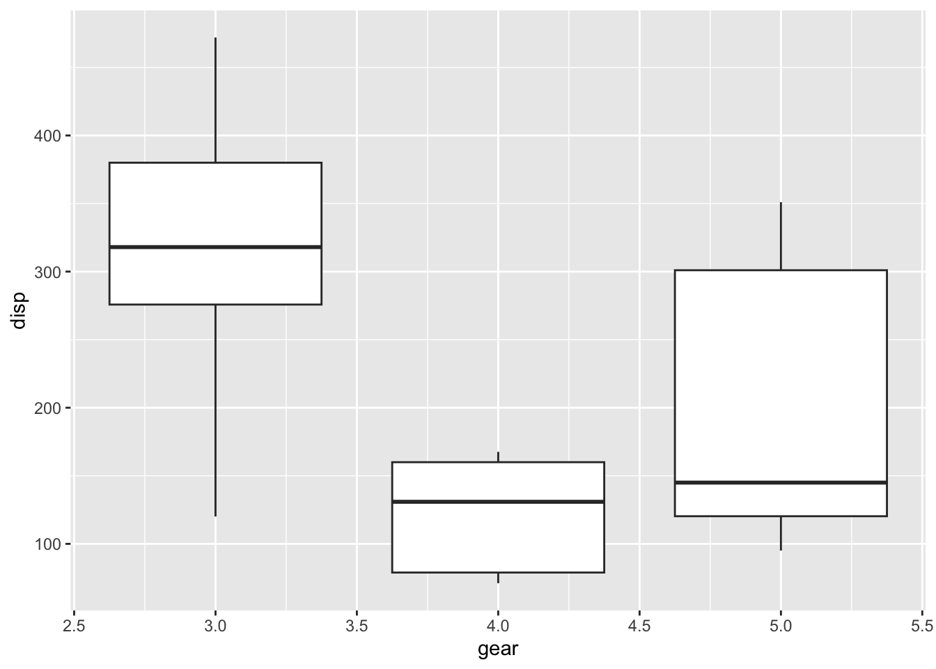
p3 <- ggplot(mtcars) +
  geom_smooth(aes(disp, qsec))
p3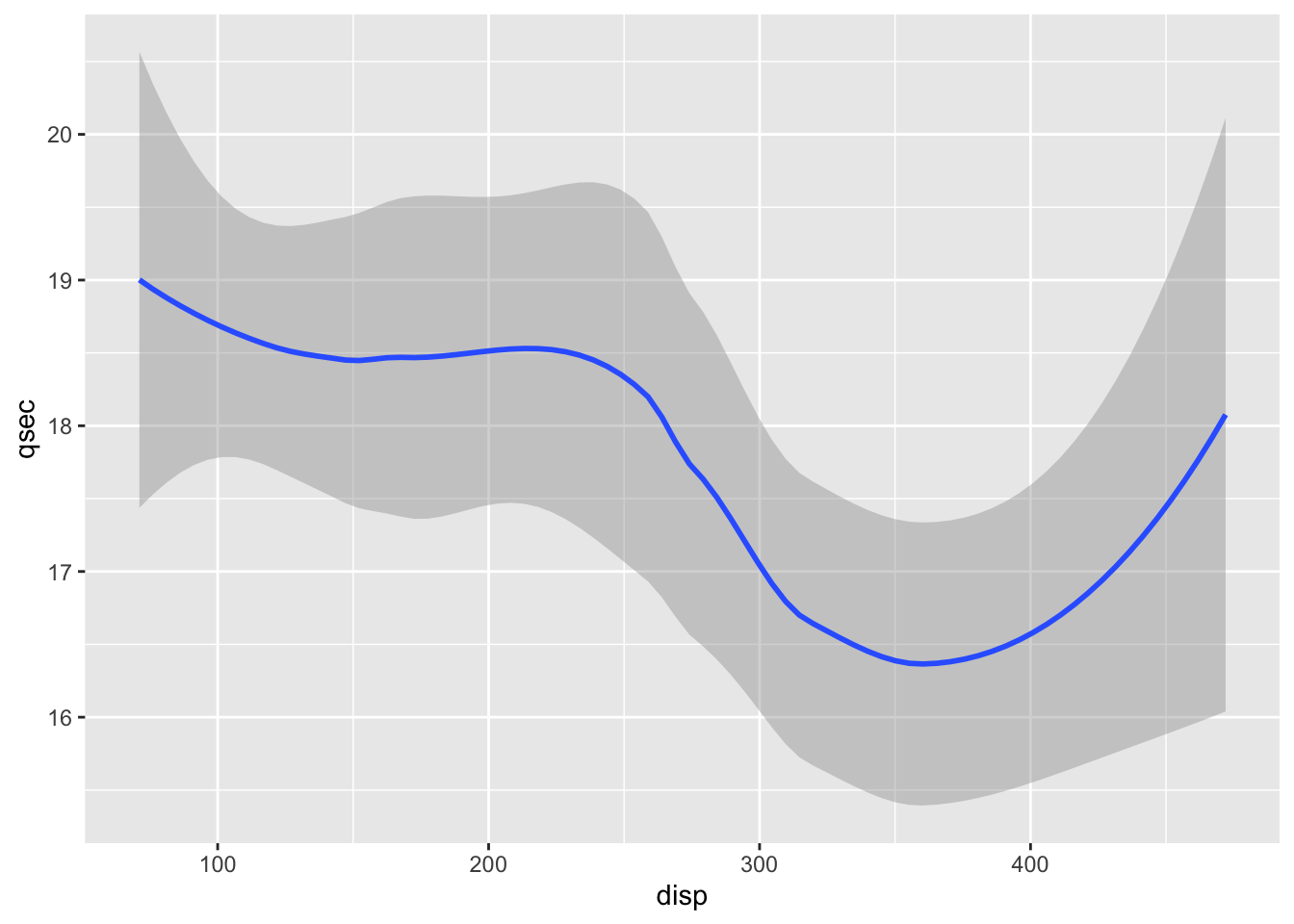
p4 <- ggplot(mtcars) +
  geom_bar(aes(carb))
p4
To show plots side-by-side, we use the operator |, as in p1 | p2. Try this by making a compound plot of plots p1, p2, p3 side-by-side.
# build all the code for this exerciseTo show plots on top of one-another, we use the operator /, as in p1 / p2. Try this by making a compound plot of plots p1, p2, p3 on top of each other.
# build all the code for this exerciseWe can also use parentheses to group plots with respect to the operators | and /. For example, we can place several plots side-by-side and then place this entire row of plots on top of another plot. Try putting p1, p2, p3, on the top row, and p4 on the bottom row.
(___) / ___Plot annotations
The patchwork package provides a powerful annotation system via the plot_annotation() function that can be added to a plot assembly. For example, we can add plot tags (the labels in the upper left corner identifying the plots) via the plot annotation tag_levels. You can set tag_levels = "A" to generate tags A, B, C, etc. Try this out.
(p1 | p2 | p3 ) / p4
Try also tag levels such as "a", "i", or "1".
You can also add elements such as titles, subtitles, and captions, by setting the title, subtitle, or caption argument in plot_annotation(). Try this out by adding an overall title to the figure from the previous exercise.
# build all the code for this exerciseAlso set a subtitle and a caption.
Finally, you can change the theme of all plots in the plot assembly via the & operator, as in (p1 | p2) & theme_bw(). Try this out.
# build all the code for this exerciseWhat happens if you write this expression without parentheses? Do you understand why?
(Big) Challenge Problem:
If you have time this morning, or if you want to work on it this afternoon, try analyzing a new dataset to test your R skills. First, learn what the columns mean, what missing values you see, and then start to ask questions about patterns in the data by making plots.
You can browse the datasets at https://github.com/rfordatascience/tidytuesday/tree/master/data (click on a year folder and go to the README to read about the datasets). Or pick from one of the ones below:
# fish consumption in different countries
consumption <- readr::read_csv('https://raw.githubusercontent.com/rfordatascience/tidytuesday/master/data/2021/2021-10-12/fish-and-seafood-consumption-per-capita.csv')

# world cup Cricket matches from 1996 to 2005
matches <- readr::read_csv('https://raw.githubusercontent.com/rfordatascience/tidytuesday/master/data/2021/2021-11-30/matches.csv')

# malaria deaths by age across the world and time.
 malaria_deaths<- readr::read_csv('https://github.com/rfordatascience/tidytuesday/blob/master/data/2018/2018-11-13/malaria_deaths_age.csv')

#meteorites and/or volcanos:
# note to plot a map, try the following:
countries_map <- ggplot2::map_data("world")
world_map<-ggplot() +
  geom_map(data = countries_map,
           map = countries_map,aes(x = long, y = lat, map_id = region, group = group),
           fill = "white", color = "black", size = 0.1) # then add geom_point() to this map to add lat/long points

meteorites <- readr::read_csv("https://raw.githubusercontent.com/rfordatascience/tidytuesday/master/data/2019/2019-06-11/meteorites.csv")
volcano <- readr::read_csv("https://raw.githubusercontent.com/rfordatascience/tidytuesday/master/data/2020/2020-05-12/volcano.csv")

# or pick any dataset from https://github.com/rfordatascience/tidytuesday/tree/master/data ,
# just click on a year folder and go to the README to read about the datasets
# if you have trouble loading a dataset there, ask for help!