reproduced from a Schmidt Science Fellowship activity, thanks to Fatima Hussain
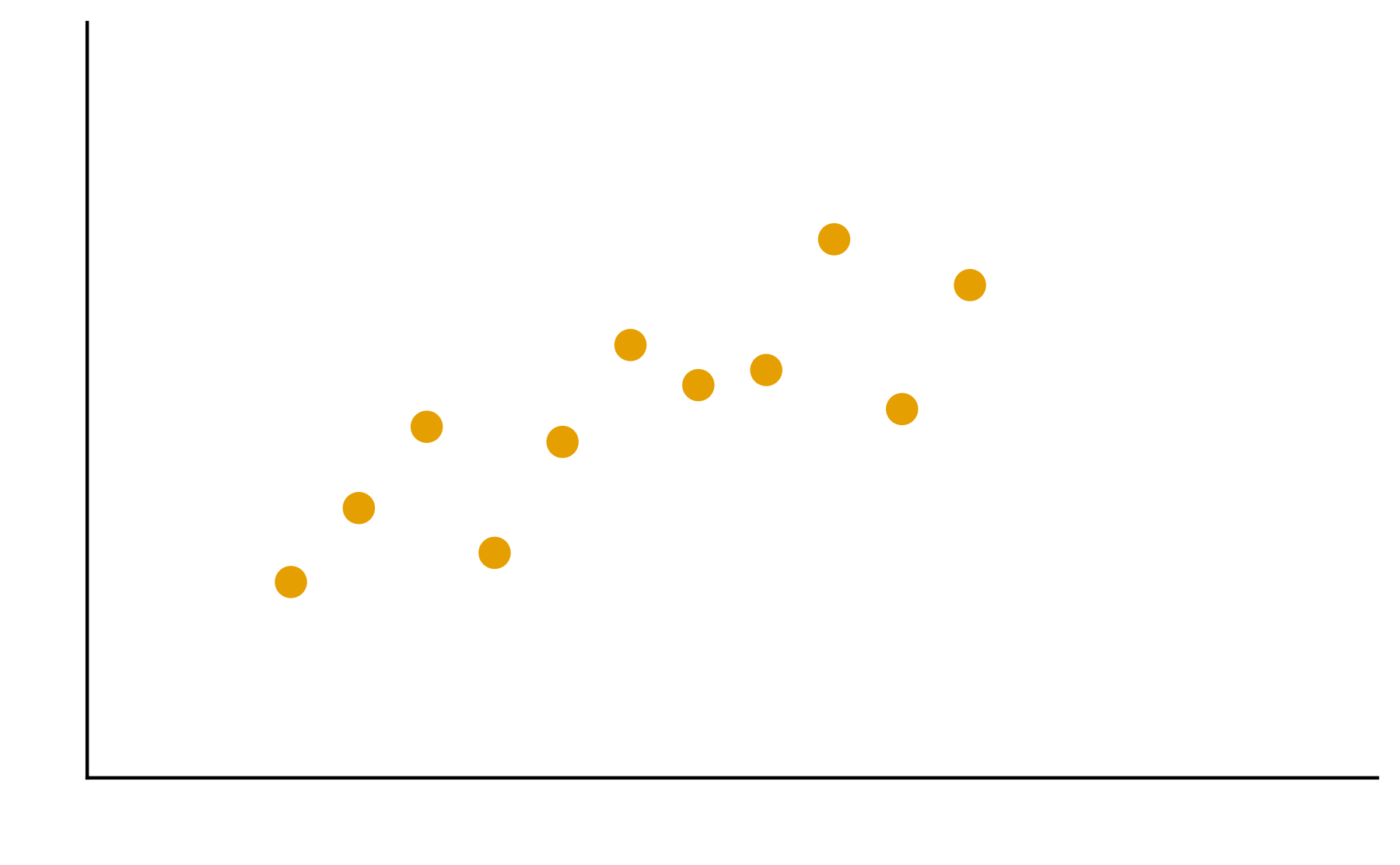
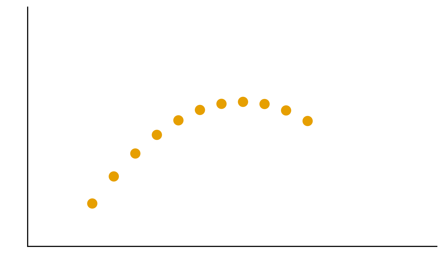
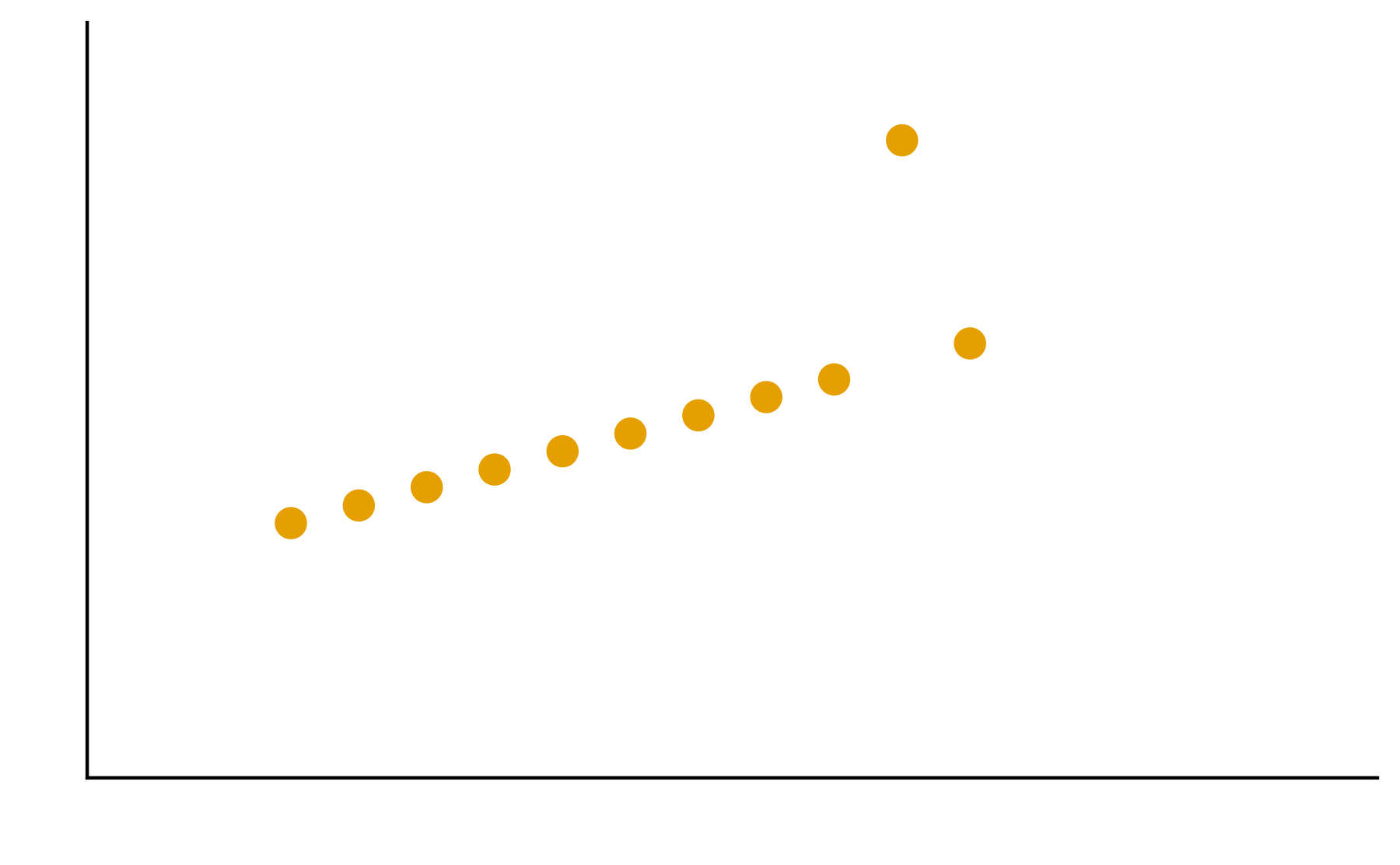
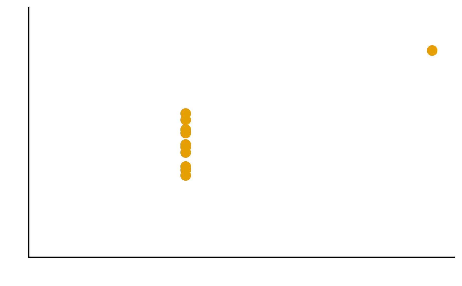
Patterns are the essence of data exploration and our eyes’ ability to pick them out is integral to data understanding. Much of the data we work with, however, do not have a natural form and we need to make decisions about how they are to be represented. Try different ways to visualize the datasets so meaningful patterns may be found.
Genetic profiles of cancer
These datasets contains 10 cancer samples. Table 1 describes the mutational status for a set of genes (A-E) and whether a mutation if absent (0) or present (1). Table 2 summarizes the expression levels of those genes, ranging from no expression (0) to high expression (3).
Table 1: Mutational status for a set of genes
sample ->
1
2
3
4
5
6
7
8
9
10
Gene A
0
0
0
0
0
1
0
0
0
0
Gene B
0
0
0
0
1
1
1
0
1
1
Gene C
0
0
1
0
0
0
1
1
1
1
Gene D
1
1
0
0
1
1
0
0
0
0
Gene E
0
1
1
0
1
0
0
0
1
0
Table 2: Expression levels for a set of genes
sample ->
1
2
3
4
5
6
7
8
9
10
Gene A
2
1
1
2
2
0
2
1
1
2
Gene B
1
1
2
1
0
0
0
2
0
0
Gene C
1
1
3
1
2
2
3
0
3
0
Gene D
0
0
2
1
3
3
2
1
1
1
Gene E
1
3
3
1
3
1
2
1
3
2
1. Think about the problem on your own for 5 minutes.
2. In your groups, discuss and create different visualizations to highlight underlying patterns
3. Summarize the group’s approach
4. Elect/volunteer a spokesperson to present the solution
Consider the following concepts when creating your visualizations
Patterns
Patterns are the essence of data exploration. What kinds of representation will produce the most meaningful insights?
Encodings
Some visual estimations are easier to make than others. How might you use encodings that are less accurate but otherwise better at conveying overall trends?
Color
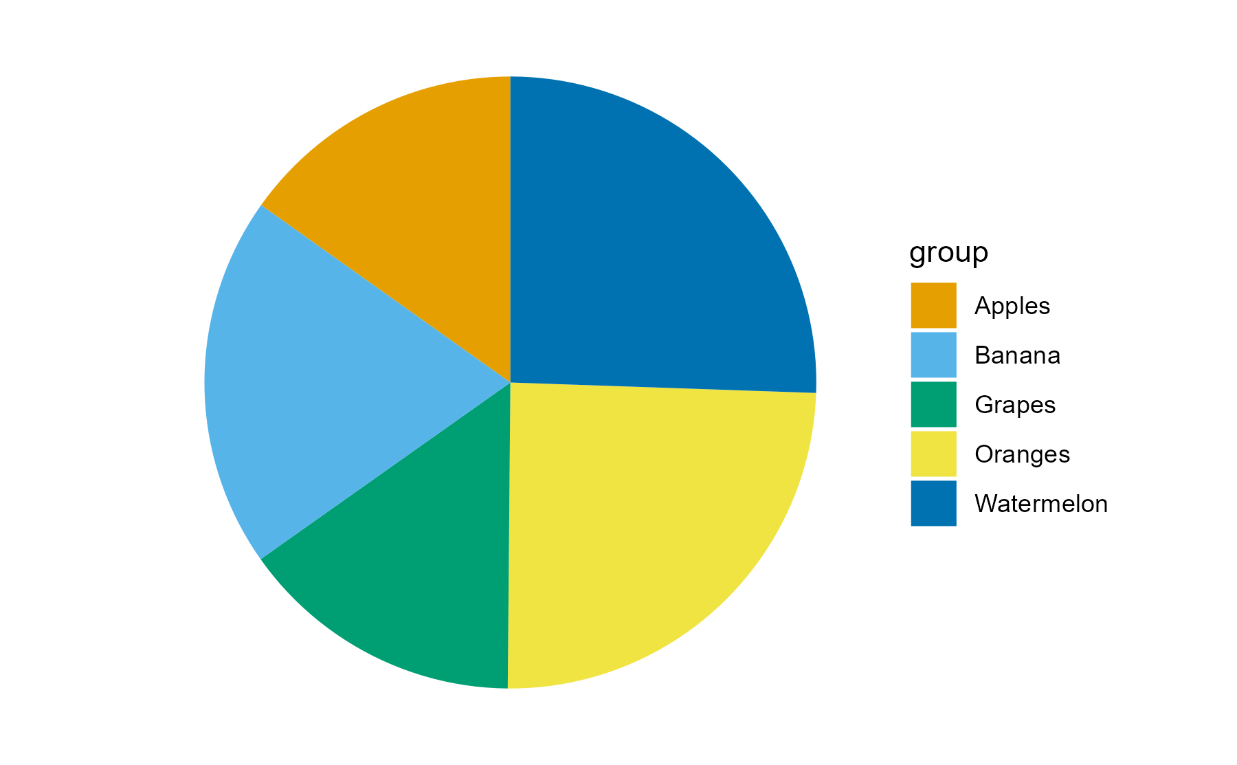
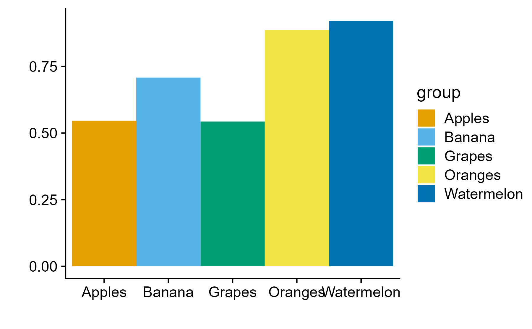
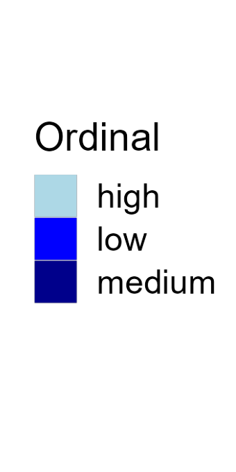
Color is a powerful encoding that presents several challenges. Have you chosen a color scale that is optimal for that data type?
Salience and Relevance
Pop-out effects enable quick recognition. Are the most noticeable elements of your visualizations also the most relevant?
In this worksheet, we will discuss a core concept of ggplot, the mapping of data values onto aesthetics.
We will be using the R package tidyverse, which includes ggplot() and related functions.
Copy the following code chunk into your quarto document. Notice the error in the read_csv() line - it wants you to supply the file name to read. Fix the error!
library(tidyverse) # load the tidyverse library# we want to use the data in the visit_clinical_measurements fileclinical_measurements <-read_csv() # read in your data
Error in read_csv(): argument "file" is missing, with no default
#then show the first few rowshead(clinical_measurements)
Error in eval(expr, envir, enclos): object 'clinical_measurements' not found
Basic use of ggplot
In the most basic use of ggplot, we call the ggplot() function with a dataset and an aesthetic mapping (created with aes()), and then we add a geom, such as geom_line() to draw lines or geom_point() to draw points.
Try this for yourself. Map the column ph onto the x axis and the column crp_blood onto the y axis, and use geom_line() to display the data.
Whenever you see ___ in the code below, that means you should swap it in with your own code.
ggplot(clinical_measurements, aes(x = ___, y = ___)) +___()
Try again. Now use geom_point() instead of geom_line().
ggplot(clinical_measurements, aes(x = ___, y = ___)) +___()
And now swap which column you map to x and which to y.
ggplot(clinical_measurements, aes(x = ___, y = ___)) +___()
More complex geoms
You can use other geoms to make different types of plots. For example, geom_boxplot() will make boxplots. For boxplots, we frequently want categorical data on the x or y axis. For example, we might want a separate boxplot for each month. Try this out. Put nugent_score on the x axis, ph on the y axis, and use geom_boxplot().
ggplot(clinical_measurements, aes(x = ___, y = ___)) +___()
Now try swapping the x and y axis geom_jitter()
ggplot(clinical_measurements, aes(x = ___, y = ___)) +___()
Now try swapping the x and y axis
ggplot(clinical_measurements, aes(x = ___, y = ___)) +___()
Adding color
Try again with geom_jitter(), this time using ph as the location along the y axis and arm for the color. Remember to check the ggplot cheat sheet, or type ?geom_jitter() in the console to and look at the “Aesthetics” section if you get stuck.
ggplot(clinical_measurements, aes(x = ___, y = ___)) +___()
(Hint: Try adding size = 3 as a parameter to the geom_jitter() to create larger points.)
Using aesthetics as parameters
Many of the aesthetics (such as color, fill, and also size to change line size or point thickness) can be used as parameters inside a geom rather than inside an aes() statement. The difference is that when you use an aesthetic as a parameter, you specify a specific value, such as color = "blue", rather than a mapping, such as aes(color = arm). Notice the difference: Inside the aes() function, we don’t actually specify the specific color values, ggplot does that for us. We only say that we want the data values of the arm column to correspond to different colors. (We will learn later how to tell ggplot to use specific colors in this mapping.)
Try this with the boxplot example from the previous section. Map arm onto the fill aesthetic but set the color of the lines to "navyblue".
ggplot(clinical_measurements, aes(x = ___, y = ___)) +___()
Now do the reverse. Map arm onto the line colors of the boxplot, but will the box with the color "navyblue".
ggplot(clinical_measurements, aes(x = ___, y = ___)) +___()
Great, that’s all for now! If you are done, but a green sticky note on your laptop!