# A tibble: 2 × 2
  smoker         n
  <chr>      <int>
1 non-smoker    27
2 smoker 17More data wrangling and data visualization with the tidyverse
remixed from Claus O. Wilke’s SDS375 course
Workshop materials are at:
https://elsherbini.github.io/durban-data-science-for-biology/
Goals for this session
Learn more advanced table commands
Learn about plotting distributions with the
tidyverse
data wrangling (n.) - the art of taking data in one format and filtering, reshaping, and deriving values to make the data format you need.
Discussions: discord
Ask questions at #workshop-questions on https://discord.gg/UDAsYTzZE.

Stickies
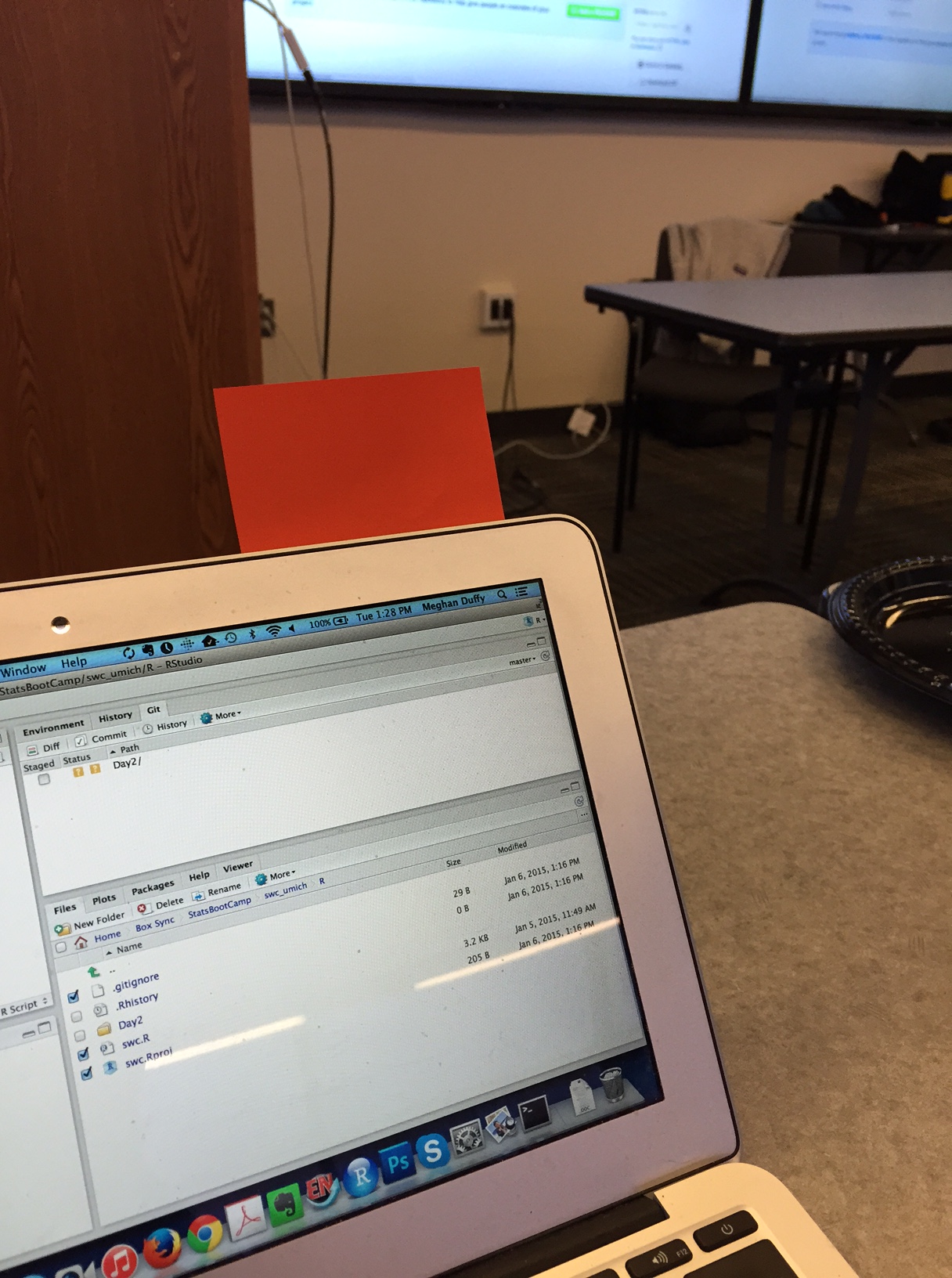
During an activity, place a yellow sticky on your laptop if you’re good to go and a pink sticky if you want help.
Image by Megan Duffy
Practicalities
WiFi:
Network: KTB Free Wifi (no password needed)
Network AHRI Password: @hR1W1F1!17
Network CAPRISA-Corp Password: corp@caprisa17
Bathrooms are out the lobby to your left
Elementary data manipulations
Yesterday:
- Pick rows:
filter() - Pick columns:
select() - Sort rows:
arrange() - Count things:
count() - Make new columns:
mutate()
Today:
- Analyze subsets:
group_by()andsummarize() - Reshape:
pivot_wider(),pivot_longer() - Combine datasets:
left_join(),inner_join(),...
Analyze subsets: group_by() and summarize()
Example application of grouping: Counting
Previously, we counted like so:
Now let’s do it the hard way
Example application of grouping: Counting
Let’s go back to the original table
# A tibble: 44 × 6
   pid    arm       smoker       age education                     sex
   <chr>  <chr>     <chr>      <dbl> <chr>                         <lgl>
 1 pid_01 placebo   non-smoker    26 grade 10-12, matriculated     FALSE
 2 pid_02 placebo   smoker        33 grade 10-12, matriculated     FALSE
 3 pid_03 placebo   smoker        30 post-secondary                FALSE
 4 pid_04 placebo   non-smoker    34 grade 10-12, not matriculated FALSE
 5 pid_05 treatment non-smoker    29 grade 10-12, matriculated     FALSE
 6 pid_06 placebo   smoker        34 post-secondary                FALSE
 7 pid_07 placebo   non-smoker    31 grade 10-12, not matriculated FALSE
 8 pid_08 placebo   smoker        30 grade 10-12, not matriculated FALSE
 9 pid_09 treatment non-smoker    35 grade 10-12, not matriculated FALSE
10 pid_10 treatment non-smoker    32 less than grade 9             FALSE
# ℹ 34 more rows
Example application of grouping: Counting
Then we group the data
# A tibble: 44 × 6
# Groups:   smoker [2]
   pid    arm       smoker       age education                     sex
   <chr>  <chr>     <chr>      <dbl> <chr>                         <lgl>
 1 pid_01 placebo   non-smoker    26 grade 10-12, matriculated     FALSE
 2 pid_02 placebo   smoker        33 grade 10-12, matriculated     FALSE
 3 pid_03 placebo   smoker        30 post-secondary                FALSE
 4 pid_04 placebo   non-smoker    34 grade 10-12, not matriculated FALSE
 5 pid_05 treatment non-smoker    29 grade 10-12, matriculated     FALSE
 6 pid_06 placebo   smoker        34 post-secondary                FALSE
 7 pid_07 placebo   non-smoker    31 grade 10-12, not matriculated FALSE
 8 pid_08 placebo   smoker        30 grade 10-12, not matriculated FALSE
 9 pid_09 treatment non-smoker    35 grade 10-12, not matriculated FALSE
10 pid_10 treatment non-smoker    32 less than grade 9             FALSE
# ℹ 34 more rows
Example application of grouping: Counting
Then we group the data, and then summarise
Example application of grouping: Counting
Now let’s group by multiple variables
# A tibble: 44 × 6
# Groups:   smoker, arm [4]
   pid    arm       smoker       age education                     sex
   <chr>  <chr>     <chr>      <dbl> <chr>                         <lgl>
 1 pid_01 placebo   non-smoker    26 grade 10-12, matriculated     FALSE
 2 pid_02 placebo   smoker        33 grade 10-12, matriculated     FALSE
 3 pid_03 placebo   smoker        30 post-secondary                FALSE
 4 pid_04 placebo   non-smoker    34 grade 10-12, not matriculated FALSE
 5 pid_05 treatment non-smoker    29 grade 10-12, matriculated     FALSE
 6 pid_06 placebo   smoker        34 post-secondary                FALSE
 7 pid_07 placebo   non-smoker    31 grade 10-12, not matriculated FALSE
 8 pid_08 placebo   smoker        30 grade 10-12, not matriculated FALSE
 9 pid_09 treatment non-smoker    35 grade 10-12, not matriculated FALSE
10 pid_10 treatment non-smoker    32 less than grade 9             FALSE
# ℹ 34 more rows
Example application of grouping: Counting
Now let’s group by multiple variables, and summarise
Example application of grouping: Counting
count(...) is a short-cut for group_by(...) %>% summarize(n = n())
group_by() and summarise()is the general method
You can make multiple summarise at once
Let’s take a poll
Go to the event on wooclap

What 4 columns do you expect in the output of this code?
Reshape: pivot_wider() and pivot_longer()
Reshaping example: Making a wide summary table
# A tibble: 8 × 3
  education                     arm           n
  <chr>                         <chr>     <int>
1 grade 10-12, matriculated     placebo       7
2 grade 10-12, matriculated     treatment     9
3 grade 10-12, not matriculated placebo      11
4 grade 10-12, not matriculated treatment     7
5 less than grade 9             placebo       2
6 less than grade 9             treatment     4
7 post-secondary                placebo       3
8 post-secondary                treatment     1
Reshaping example: Making a wide summary table
Reshaping example: Making a wide summary table
```{r}
education_wide <- table_01 %>%
  count(education, arm) %>%
  pivot_wider(names_from = arm, values_from = n)

education_wide %>%
  pivot_longer(-education, names_to = "arm", values_to = "n")
```
# A tibble: 8 × 3
education arm n
<chr> <chr> <int>
1 grade 10-12, matriculated placebo 7
2 grade 10-12, matriculated treatment 9
3 grade 10-12, not matriculated placebo 11
4 grade 10-12, not matriculated treatment 7
5 less than grade 9 placebo 2
6 less than grade 9 treatment 4
7 post-secondary placebo 3
8 post-secondary treatment 1combining datasets: joins
We use joins to add columns from one table into another
Joins turn two tables into one

There are different types of joins
The differences are all about how to handle when the two tables have different key values
left_join() - the resulting table always has the same key_values as the “left” table
right_join() - the resulting table always has the same key_values as the “right” table
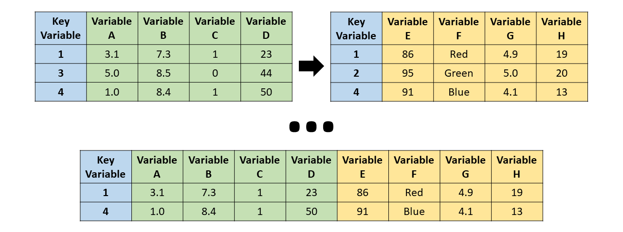
inner_join() - the resulting table always only keeps the key_values that are in both tables
full_join() - the resulting table always has all key_values found in both tables
Left Join
left_join() - the resulting table always has the same key_values as the “left” table
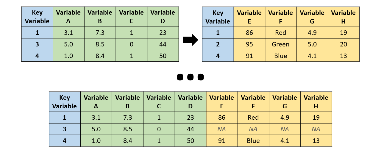
Right Join
right_join() - the resulting table always has the same key_values as the “right” table

inner_join
inner_join() - the resulting table always only keeps the key_values that are in both tables
Full join
full_join() - the resulting table always has all key_values found in both tables

But what are those NAs?
Aside: NA is how R denotes missing data
Check out the naniar package for help seeing the missing data in your datasets
In case of doubt, use left_join()
Note, merging tables vertically is bind_rows(), not a join

by default, joins will match all column names in common
Joining with `by = join_by(pid, arm)`# A tibble: 132 × 10
pid arm smoker age education sex time_point nugent_score crp_blood
<chr> <chr> <chr> <dbl> <chr> <lgl> <chr> <dbl> <dbl>
1 pid_01 placebo non-s… 26 grade 10… FALSE baseline 8 0.44
2 pid_01 placebo non-s… 26 grade 10… FALSE week_1 7 1.66
3 pid_01 placebo non-s… 26 grade 10… FALSE week_7 7 1.44
4 pid_02 placebo smoker 33 grade 10… FALSE baseline 7 1.55
5 pid_02 placebo smoker 33 grade 10… FALSE week_1 7 0.75
6 pid_02 placebo smoker 33 grade 10… FALSE week_7 4 1.17
7 pid_03 placebo smoker 30 post-sec… FALSE baseline 6 1.78
8 pid_03 placebo smoker 30 post-sec… FALSE week_1 10 0.57
9 pid_03 placebo smoker 30 post-sec… FALSE week_7 7 1.79
10 pid_04 placebo non-s… 34 grade 10… FALSE baseline 5 1.76
# ℹ 122 more rows
# ℹ 1 more variable: ph <dbl>Exercise
That’s enough slides for now time to try for yourself! Go to the module and go to the first exercise.
30:00
Visualizing distributions
Histograms and density plots
| age | sex | class | survived |
|---|---|---|---|
| 0.17 | female | 3rd | survived |
| 0.33 | male | 3rd | died |
| 0.80 | male | 2nd | survived |
| 0.83 | male | 2nd | survived |
| 0.83 | male | 3rd | survived |
| 0.92 | male | 1st | survived |
| 1.00 | female | 2nd | survived |
| 1.00 | female | 3rd | survived |
| 1.00 | male | 2nd | survived |
| 1.00 | male | 2nd | survived |
| 1.00 | male | 3rd | survived |
| 1.50 | female | 3rd | died |
| age | sex | class | survived |
|---|---|---|---|
| 1.5 | female | 3rd | died |
| 2.0 | female | 1st | died |
| 2.0 | female | 2nd | survived |
| 2.0 | female | 3rd | died |
| 2.0 | female | 3rd | died |
| 2.0 | male | 2nd | survived |
| 2.0 | male | 2nd | survived |
| 2.0 | male | 2nd | survived |
| 3.0 | female | 2nd | survived |
| 3.0 | female | 3rd | survived |
| 3.0 | male | 2nd | survived |
| 3.0 | male | 2nd | survived |
| age | sex | class | survived |
|---|---|---|---|
| 3 | male | 3rd | survived |
| 3 | male | 3rd | survived |
| 4 | female | 2nd | survived |
| 4 | female | 2nd | survived |
| 4 | female | 3rd | survived |
| 4 | female | 3rd | survived |
| 4 | male | 1st | survived |
| 4 | male | 3rd | died |
| 4 | male | 3rd | survived |
| 5 | female | 3rd | survived |
| 5 | female | 3rd | survived |
| 5 | male | 3rd | died |
Define bins and count classes
| age range | count |
|---|---|
| 0–5 | 36 |
| 6–10 | 19 |
| 11–15 | 18 |
| 16–20 | 99 |
| 21–25 | 139 |
| 26–30 | 121 |
| 31–35 | 76 |
| 36–40 | 74 |
| age range | count |
|---|---|
| 41–45 | 54 |
| 46–50 | 50 |
| 51–55 | 26 |
| 56–60 | 22 |
| 61–65 | 16 |
| 66–70 | 3 |
| 71–75 | 3 |
| 76–80 | 0 |
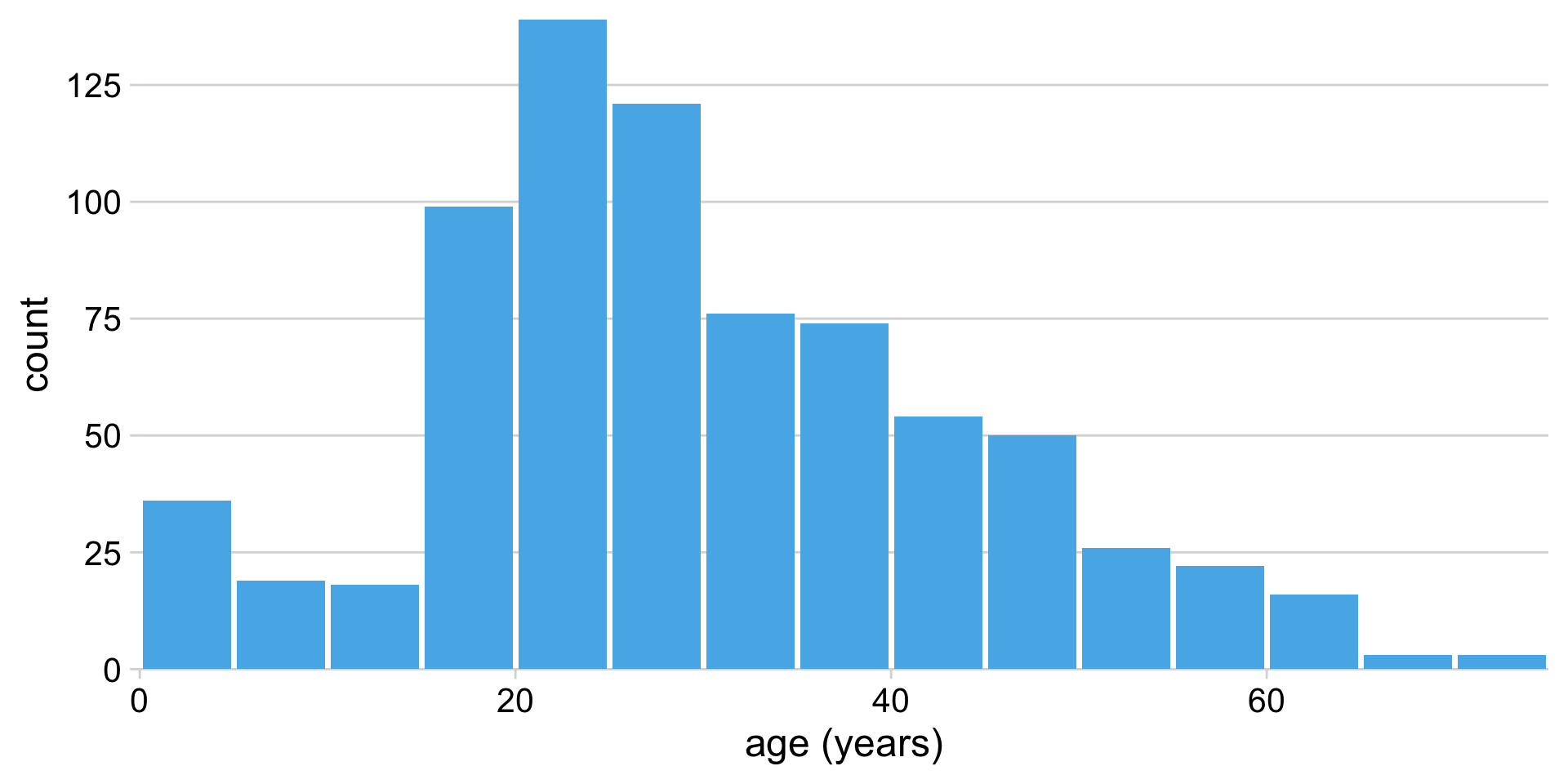
Histograms depend on the chosen bin width
Alternative to histogram: Kernel density estimate (KDE)
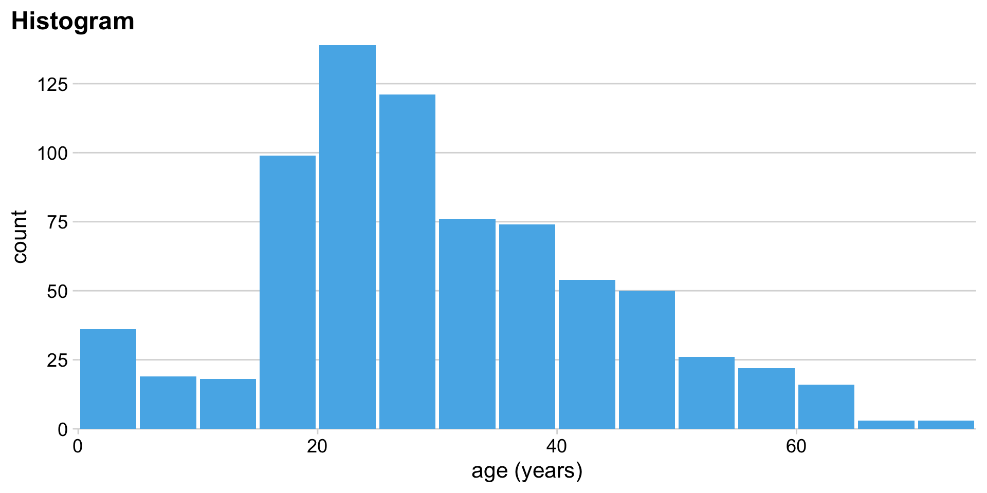
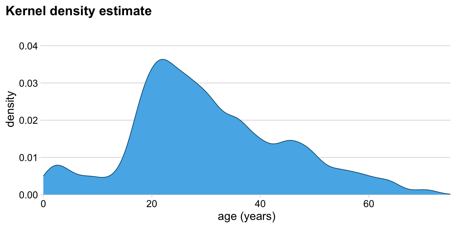
Histograms show raw counts, KDEs show proportions. (Total area = 1)
KDEs also depend on parameter settings
Careful: KDEs can show non-sensical data
Careful, are bars stacked or overlapping?
Alternatively: Age pyramid
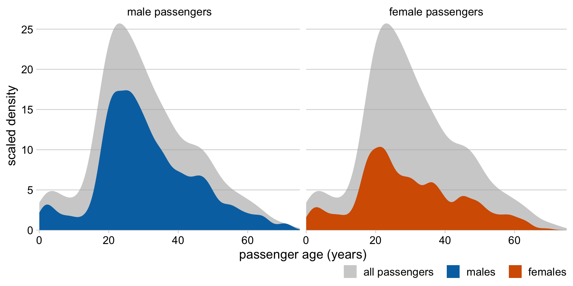
Alternatively: KDEs showing proportions of total
Histograms and density plots in ggplot2
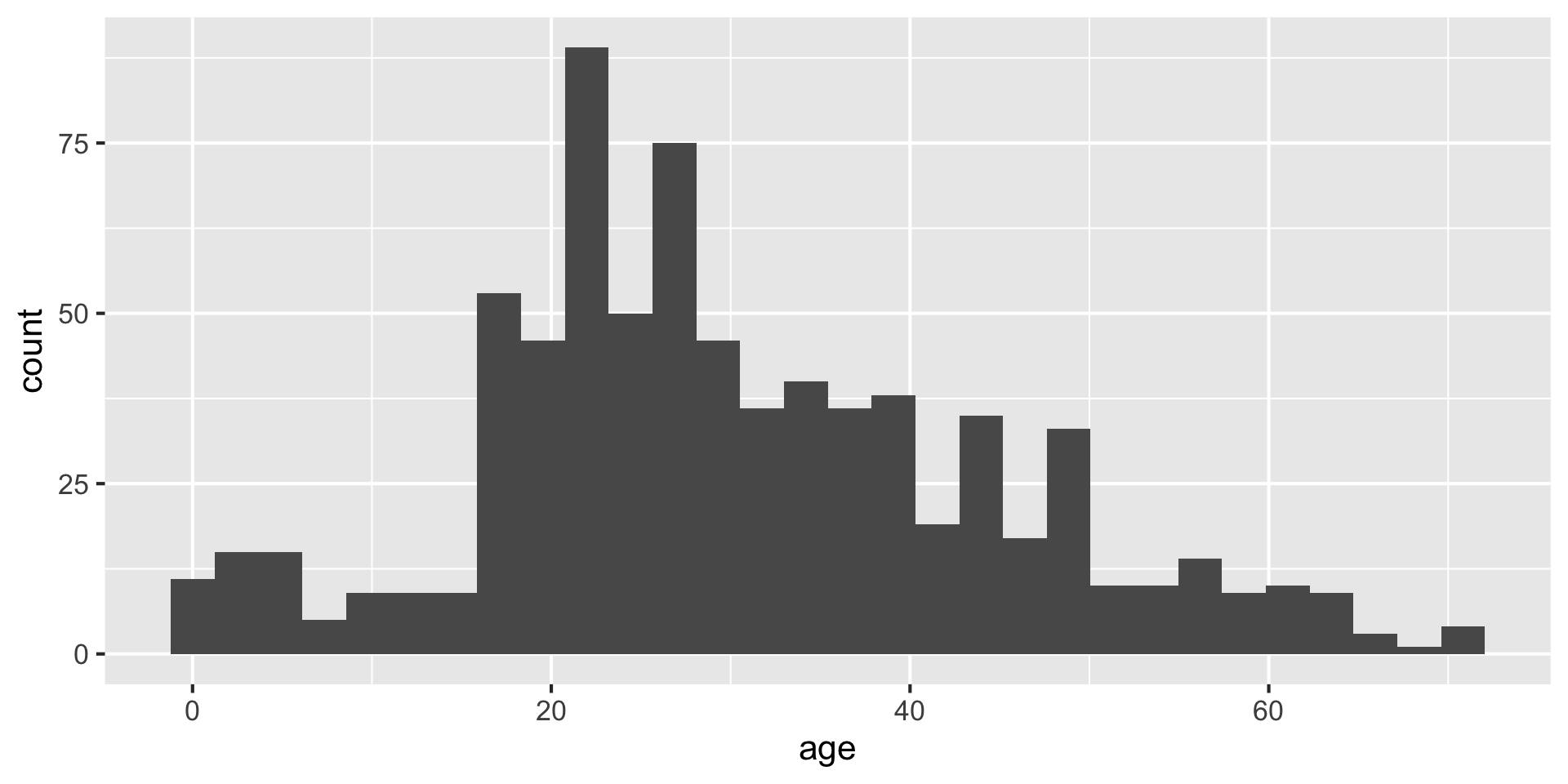
Making histograms with ggplot: geom_histogram()
Setting the bin width
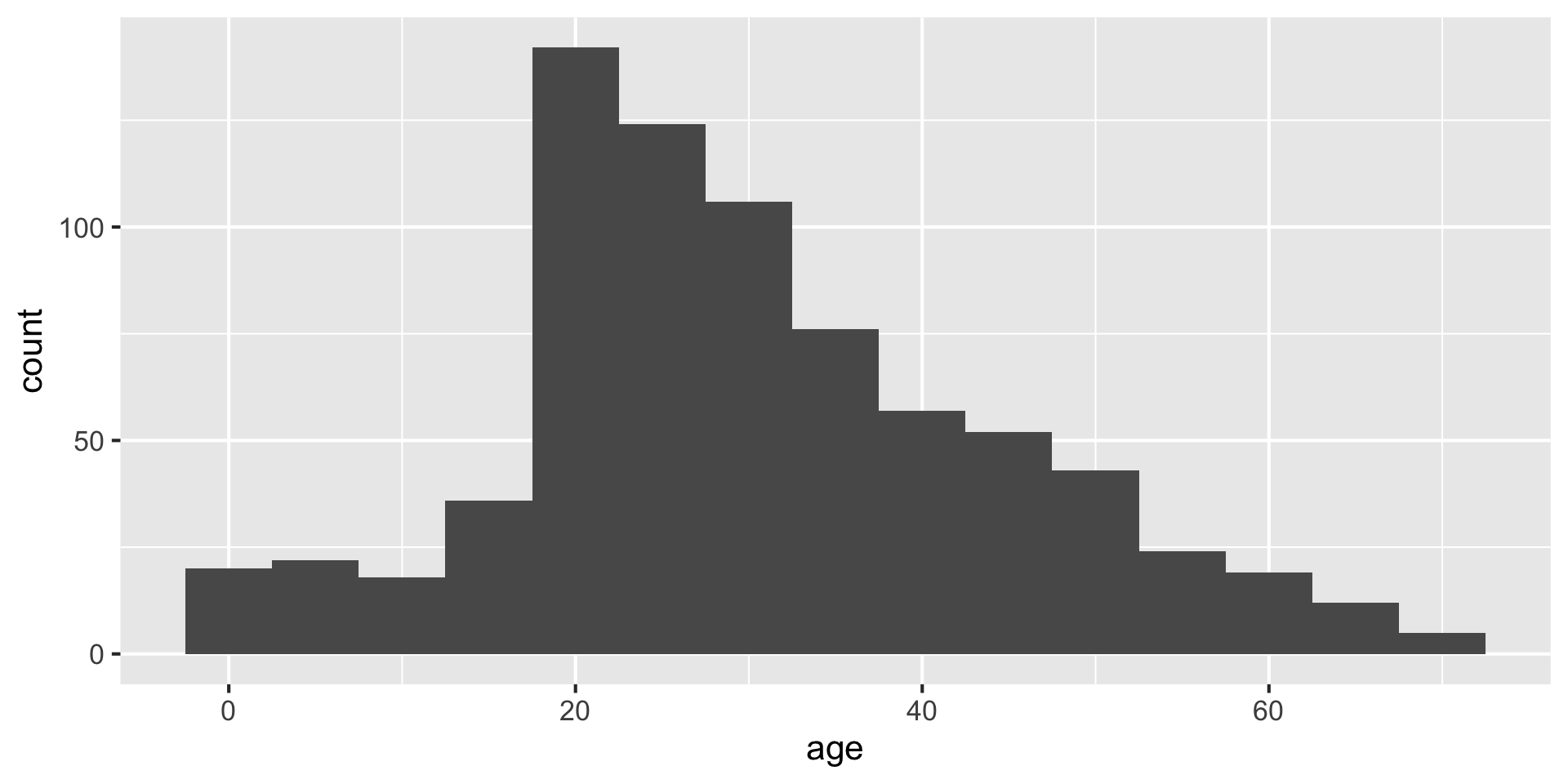
Do you like where there bins are? What does the first bin say?
Always set the center as well, to half the bin_width
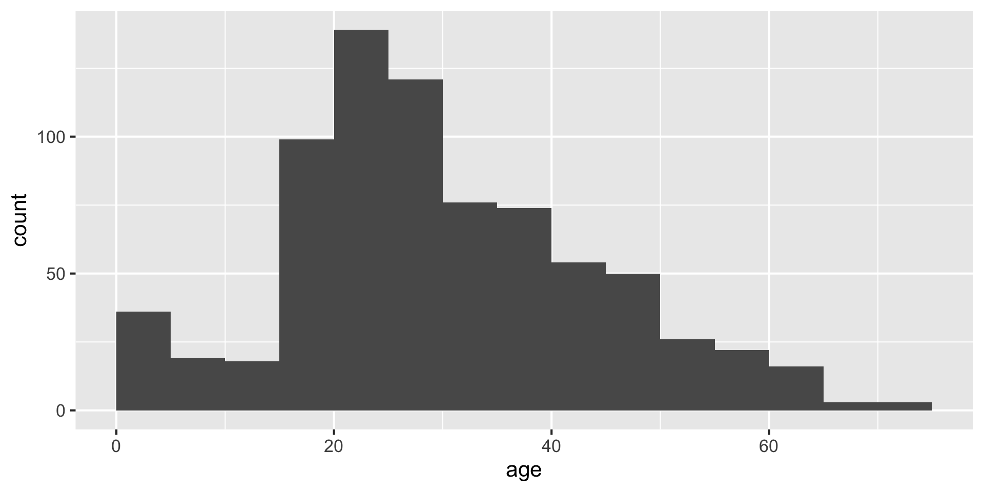
Setting center 2.5 makes the bars start 0-5, 5-10, etc. instead of 2.5-7.5, etc. You could instead use the argument boundary=5 to accomplish the same behavior.
Making density plots with ggplot: geom_density() {auto-animate:true}
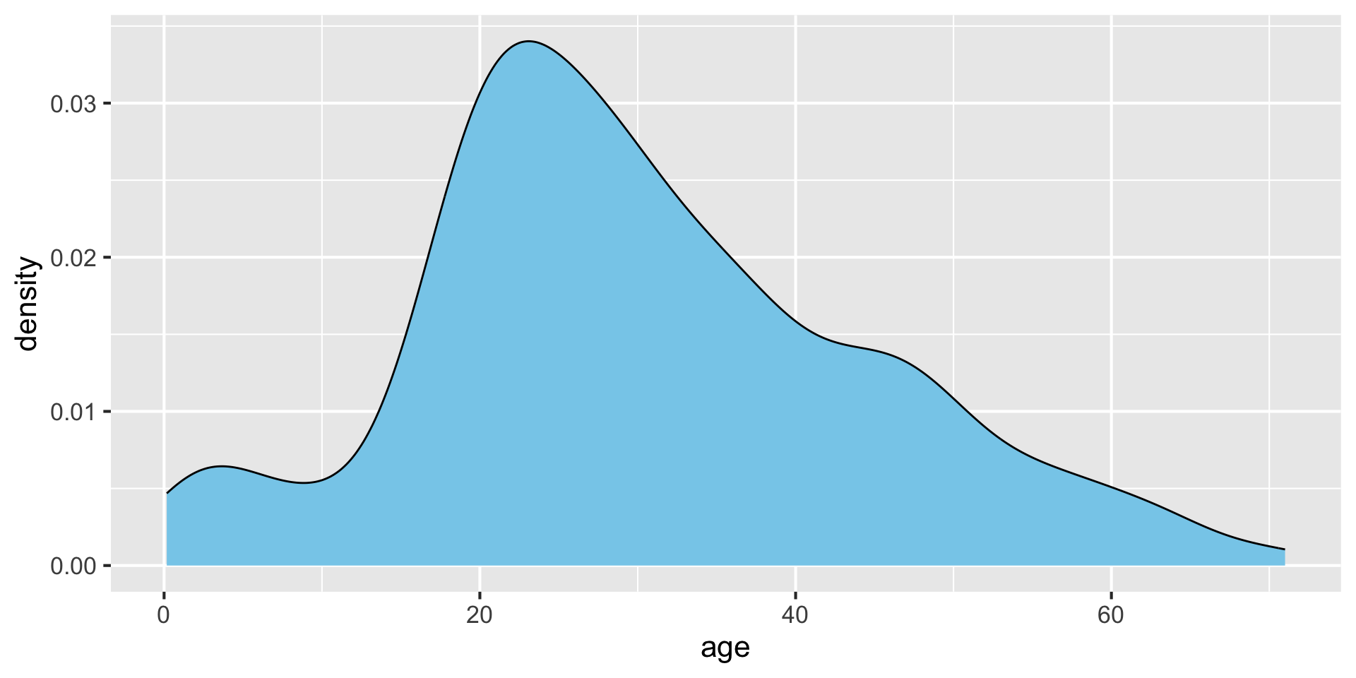
Making density plots with ggplot: geom_density() {auto-animate:true}
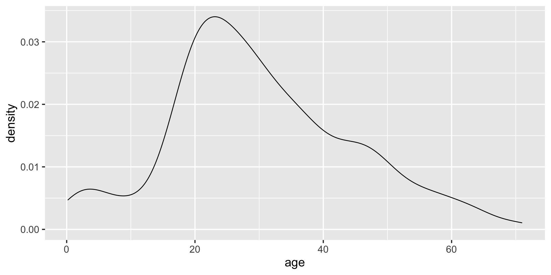
without fill
Modifying bandwidth (bw) and kernel parameters {auto-animate:true}
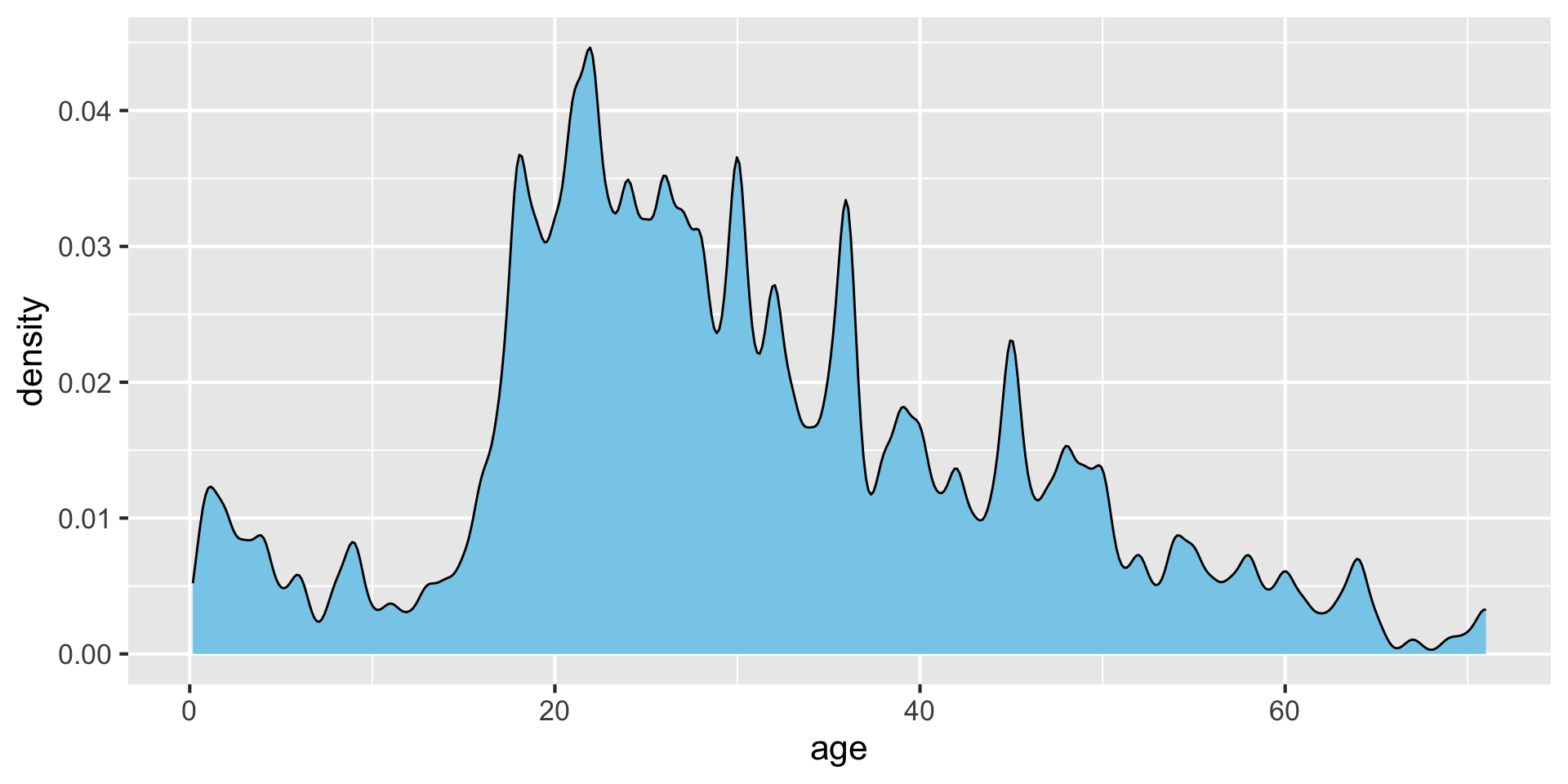
Modifying bandwidth (bw) and kernel parameters {auto-animate:true}
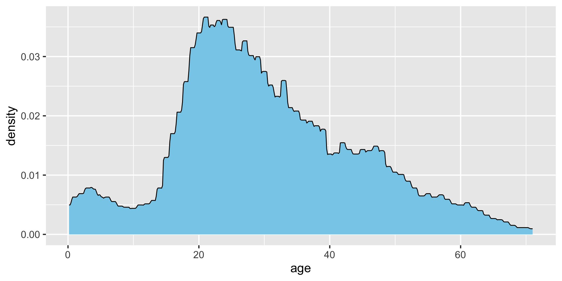
Density estimates visualize distributions
Mean temperatures in Lincoln, NE, in January 2016:
| date | mean temp |
|---|---|
| 2016-01-01 | -4 |
| 2016-01-02 | -5 |
| 2016-01-03 | -5 |
| 2016-01-04 | -8 |
| 2016-01-05 | -2 |
| 2016-01-06 | 1 |
| 2016-01-07 | -1 |
| 2016-01-08 | -4 |
| 2016-01-09 | -13 |
| 2016-01-10 | -12 |
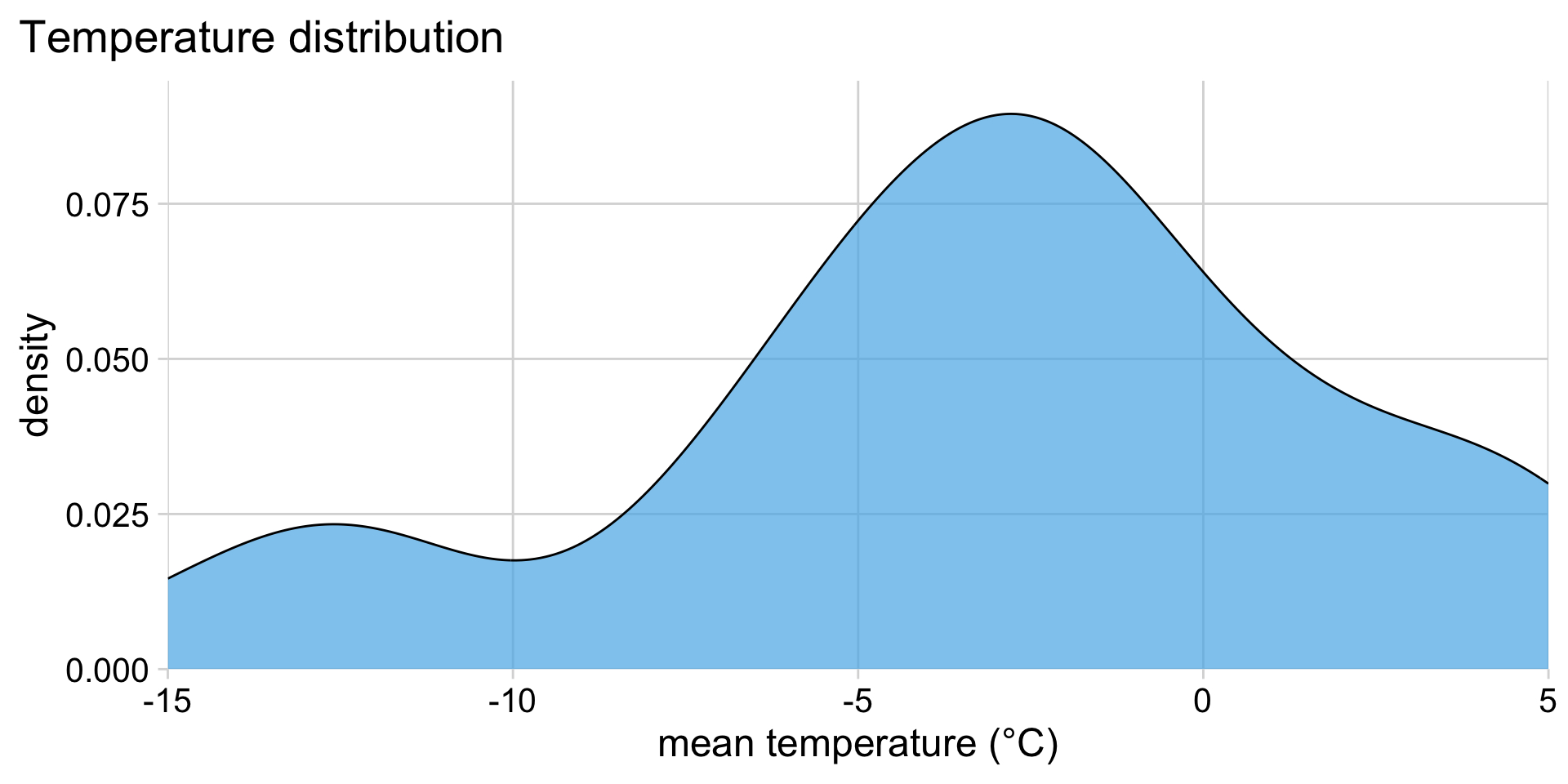
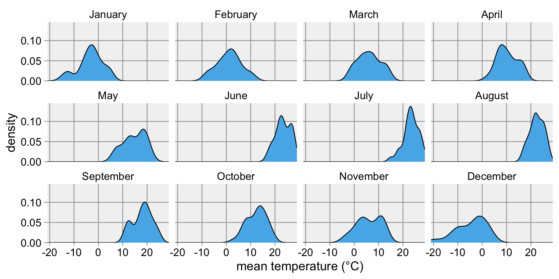
How can we compare distributions across months?
A bad idea: Many overlapping density plots
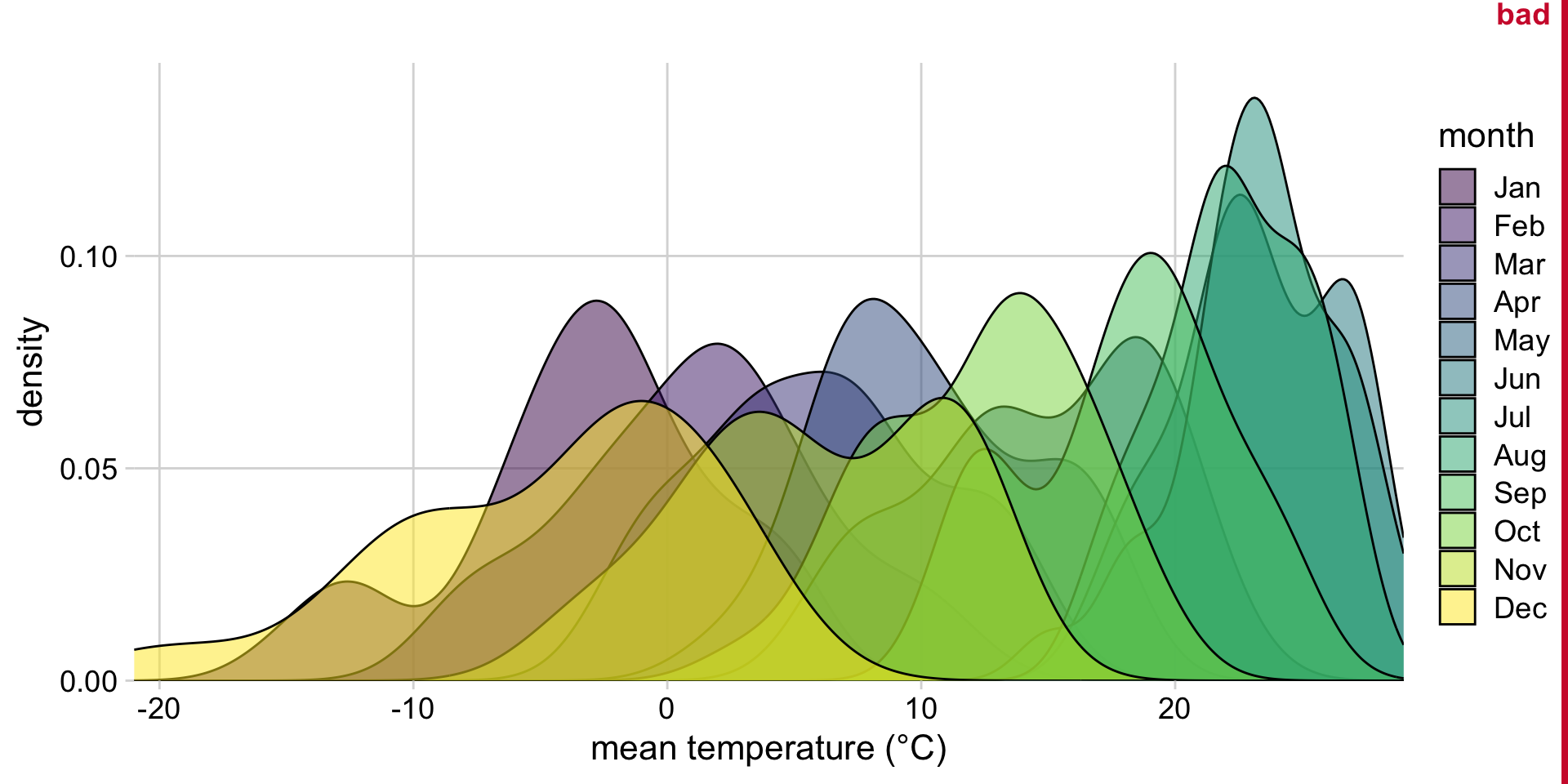
Another bad idea: Stacked density plots
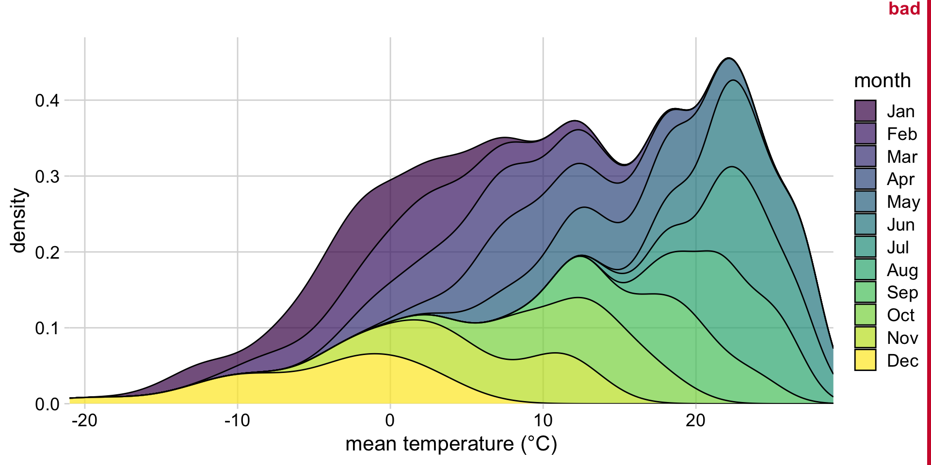
Somewhat better: Small multiples
Instead: Show values along y, conditions along x
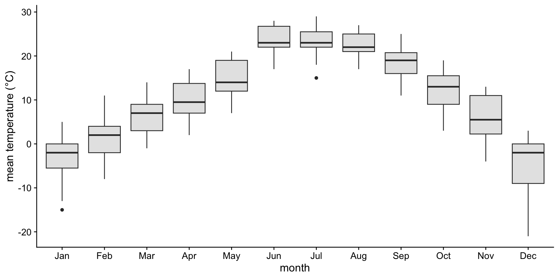
A boxplot is a crude way of visualizing a distribution.
How to read a boxplot
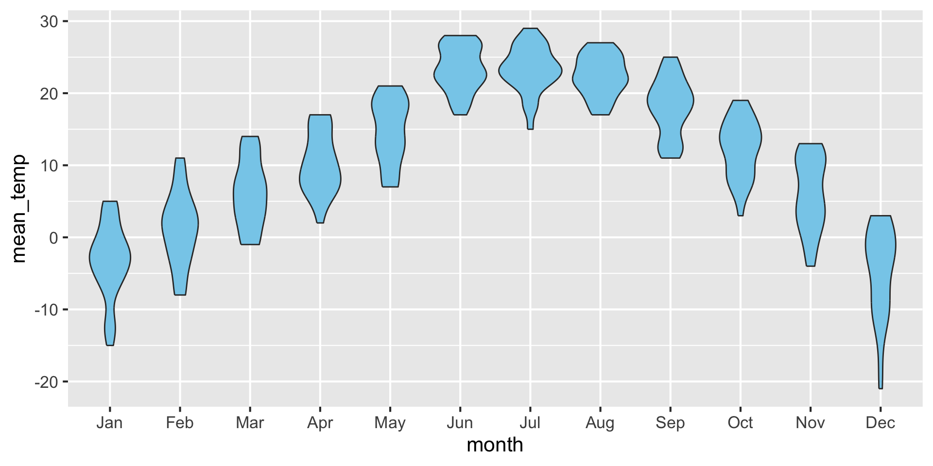
If you like density plots, consider violins
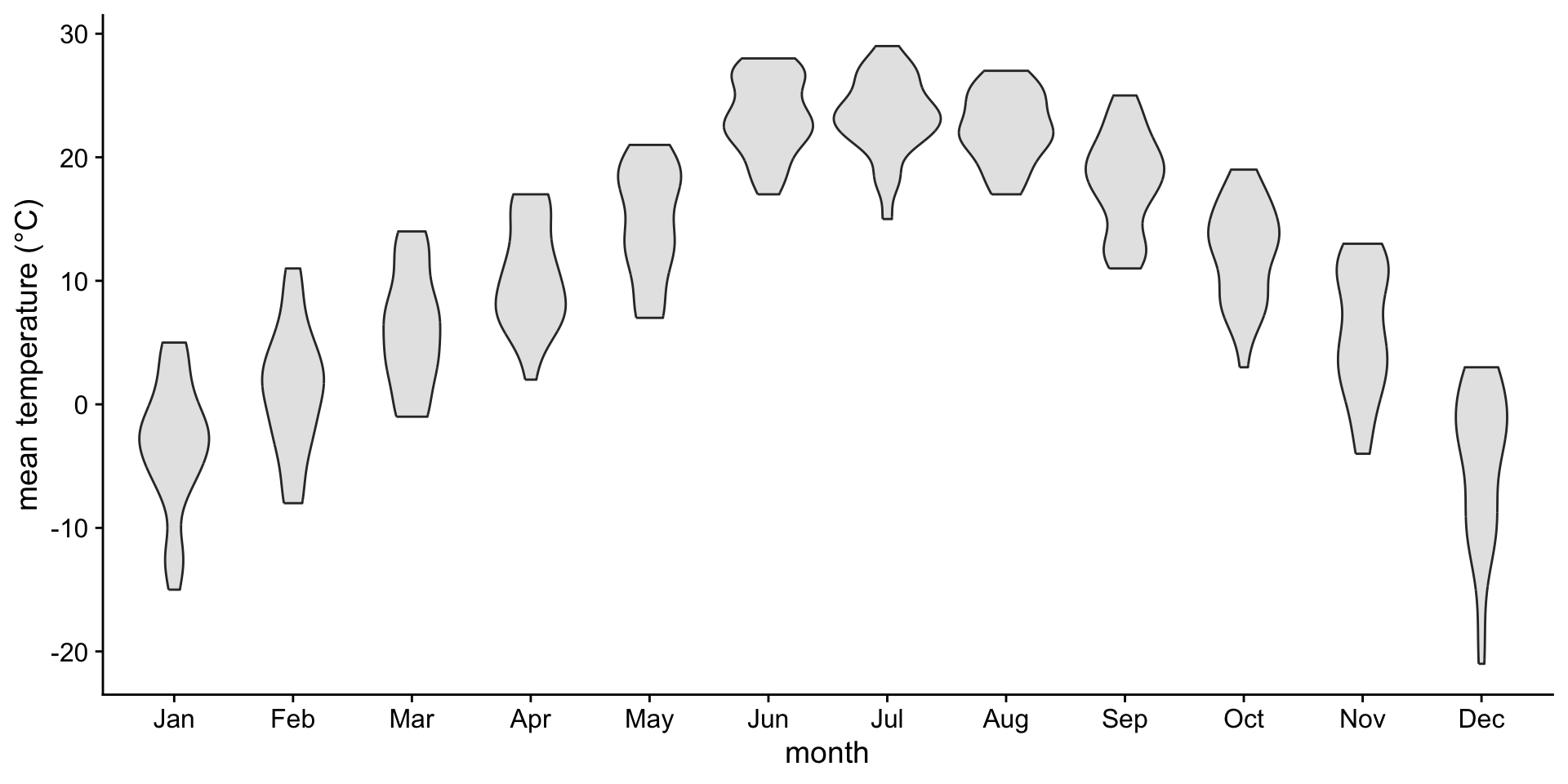
A violin plot is a density plot rotated 90 degrees and then mirrored.
How to read a violin plot
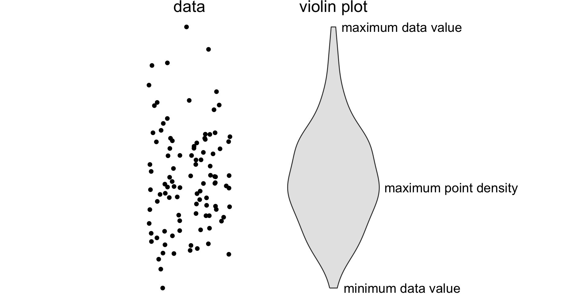
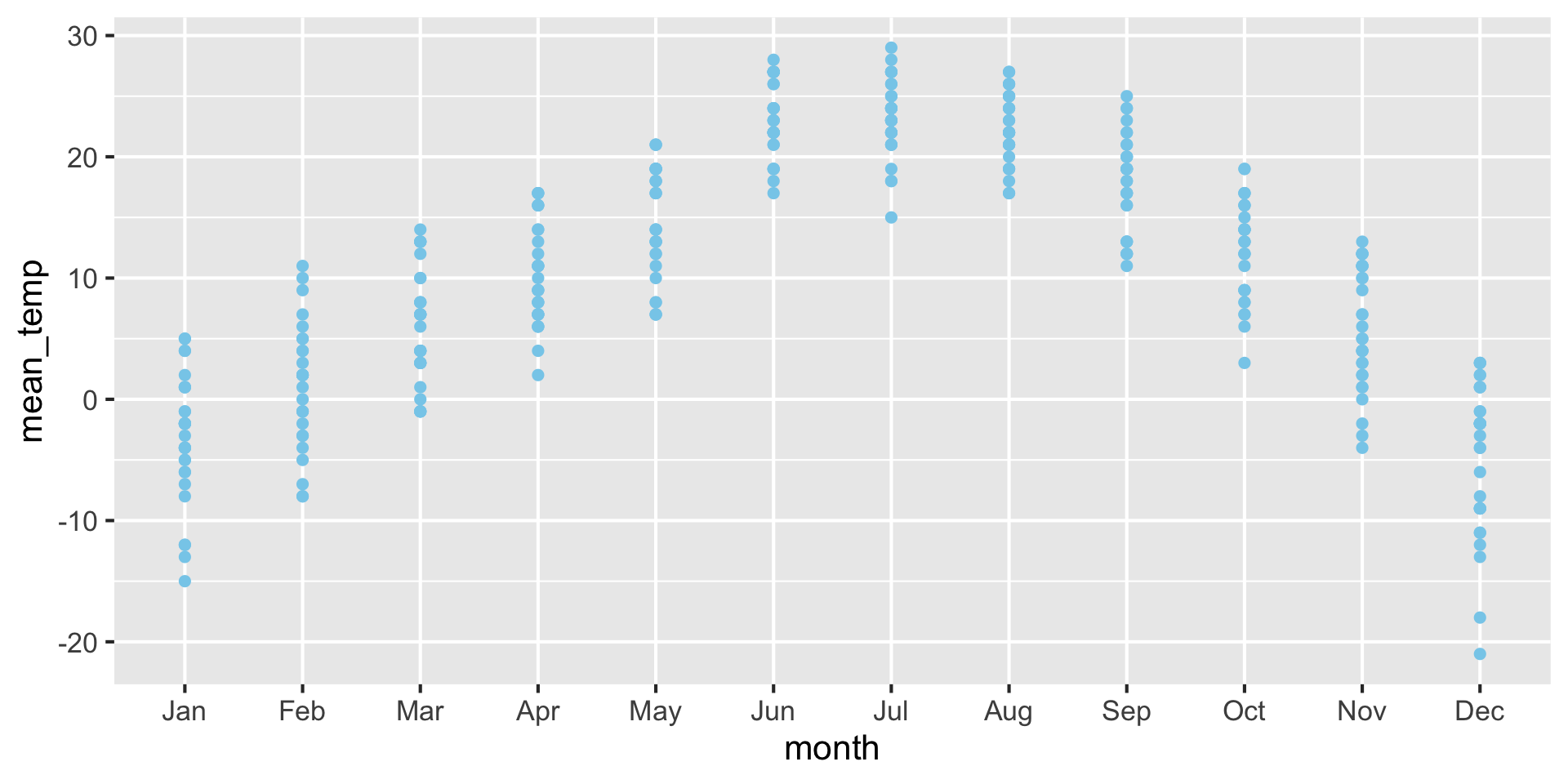
For small datasets, you can also use a strip chart
Advantage: Can see raw data points instead of abstract representation.
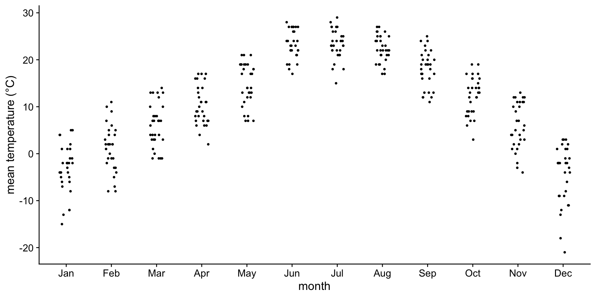
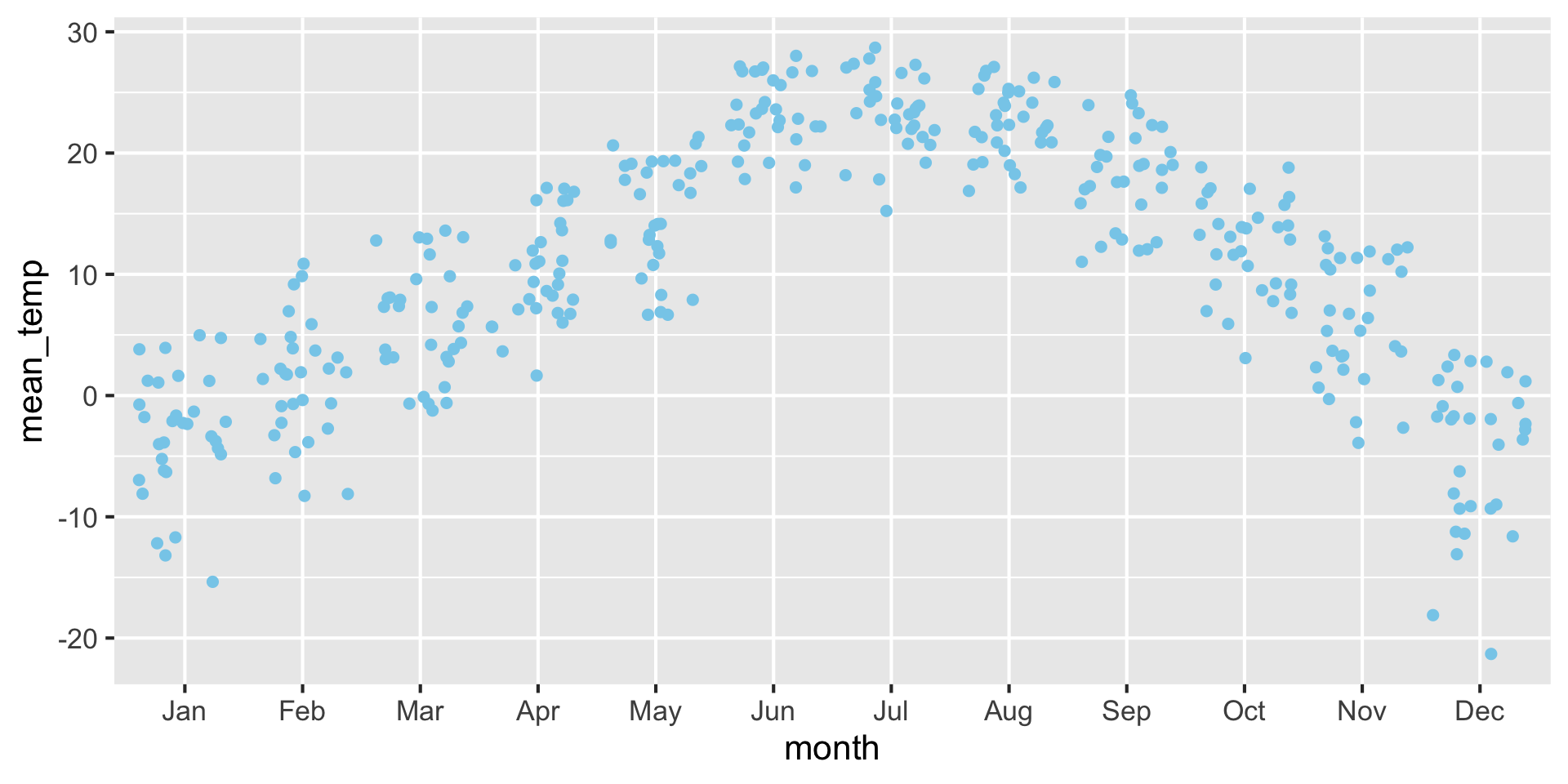
Horizontal jittering may be necessary to avoid overlapping points.
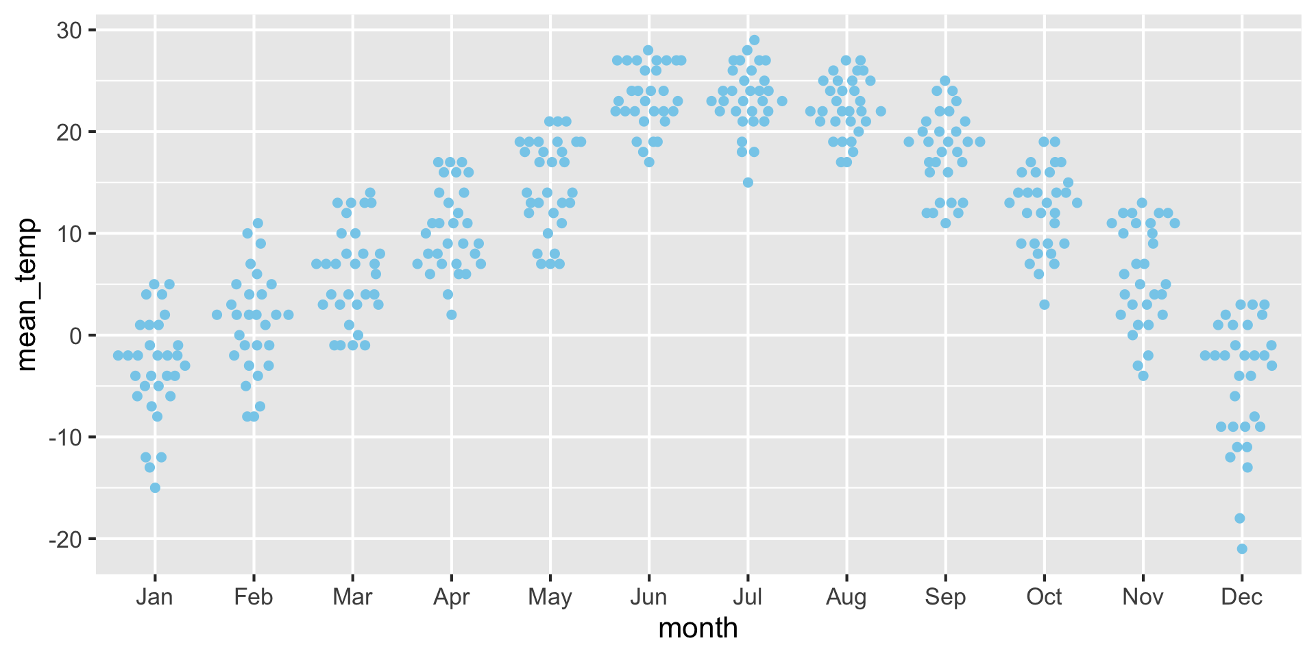
Another option is a scatter-density plot
Advantage: Best of both worlds for violin and jitter plot, see the raw data but also see the shape of the density
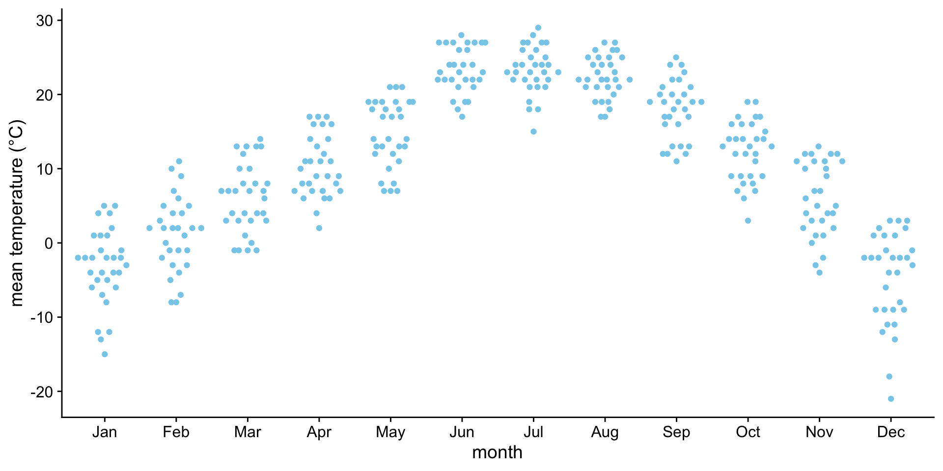
Advice - always show the finest granularity of data that is practical.
If you don’t have too many points, show them! It makes it much easier to interpret the data. Especially when you are exploring new datasets.
Favor showing distributions over just a mean with error bars.
Making boxplots, violins, etc. in ggplot2
Making boxplots, violins, etc. in ggplot2
| Plot type | Geom | Notes |
|---|---|---|
| boxplot | geom_boxplot() |
|
| violin plot | geom_violin() |
|
| strip chart | geom_point() |
Jittering requires position_jitter() |
| sina plot | geom_sina() |
From package ggforce |
| scatter-density plot | geom_quasirandom() |
From package ggbeeswarm |
| ridgeline | geom_density_ridges() |
From package ggridges |
Examples: Boxplot {auto-animate: true}
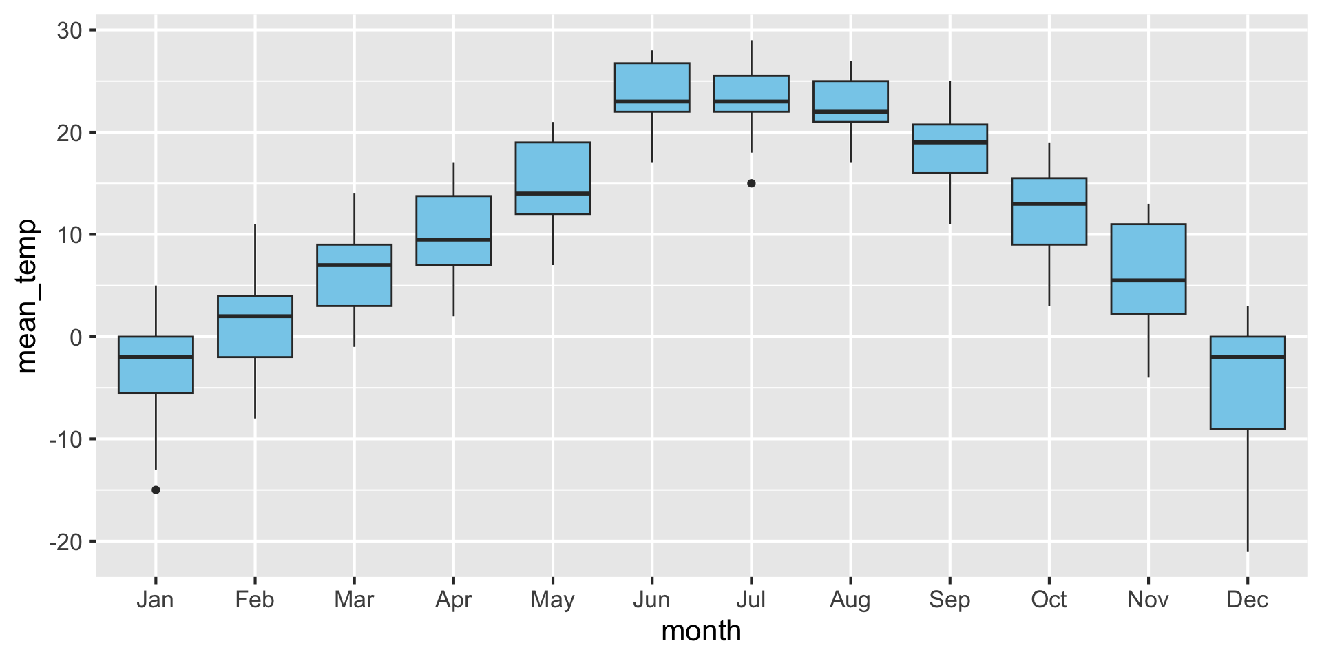
Examples: Violins {auto-animate: true}
Examples: Strip chart (no jitter) {auto-animate: true}
Examples: Strip chart (w/ jitter) {auto-animate: true}
Examples: Scatter density plot {auto-animate: true}
Exercise
Try exploring different continuous variables in table 01, table 02, and table_03 using these density visualization strategies.