# A tibble: 6 × 6
  pid    time_point arm     nugent_score crp_blood    ph
  <chr>  <chr>      <chr>          <dbl>     <dbl> <dbl>
1 pid_01 baseline   placebo            8      0.44   5.7
2 pid_01 week_1     placebo            7      1.66   5.2
3 pid_01 week_7     placebo            7      1.44   5.4
4 pid_02 baseline   placebo            7      1.55   5.2
5 pid_02 week_1     placebo            7      0.75   4.8
6 pid_02 week_7 placebo 4 1.17 4.2Intro to data wrangling and visualization with the tidyverse
Workshop 1, Module 3
Discussions: discord
Ask questions in the #workshop-questions channel.
Join the Discord server: https://discord.gg/zSBTQ9ctt

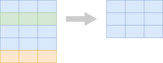
filter() picks rows
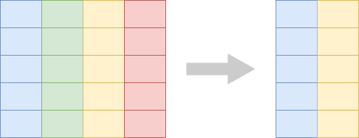
select() picks columns
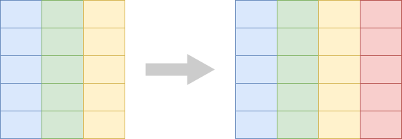
mutate() adds derived columns
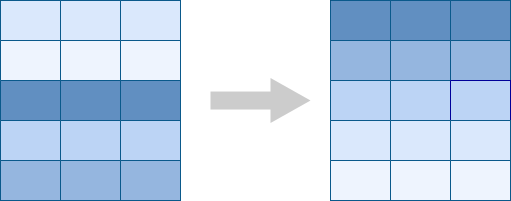
arrange() sorts rows
Let’s take a poll
Go to the event on wooclap

From rows to marks
In the wrangling half, every row of the table meant something specific (a participant, a participant-visit).
In a plot, every row of the data becomes a mark — a point, a bar, a box.
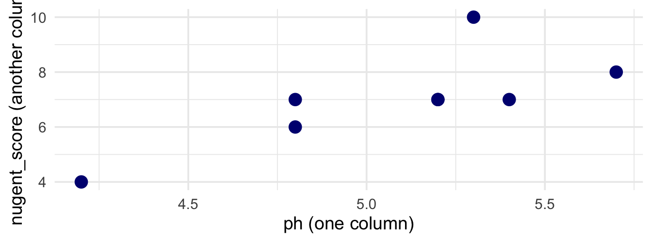
Each of the 8 points above came from 8 rows of table_02. The plotting half asks: what is each mark, and how is each mark connected to a row?
What plot answers your question?
- compare a number across groups → boxplot
- relate two numbers → scatter
- compare counts across categories → bar
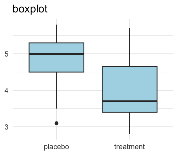
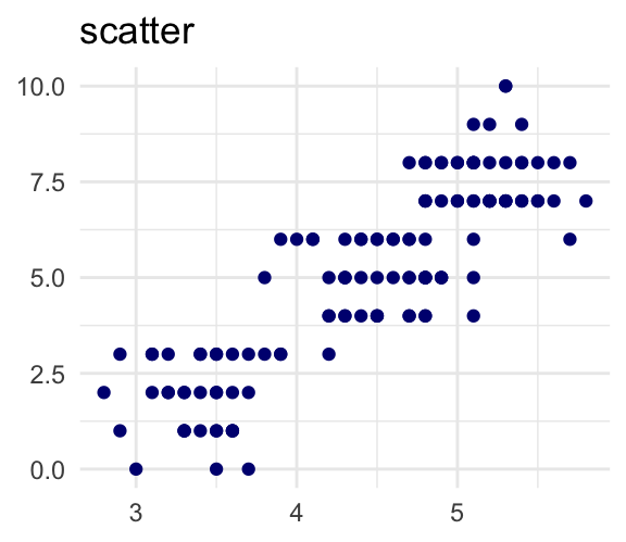
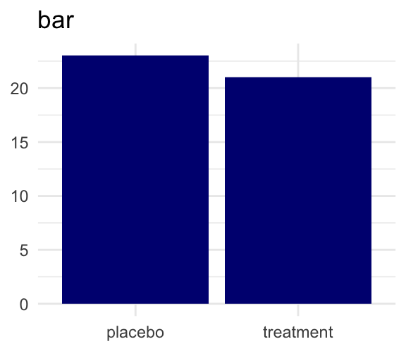
Pick the plot to fit the question.
Every plot has three pieces
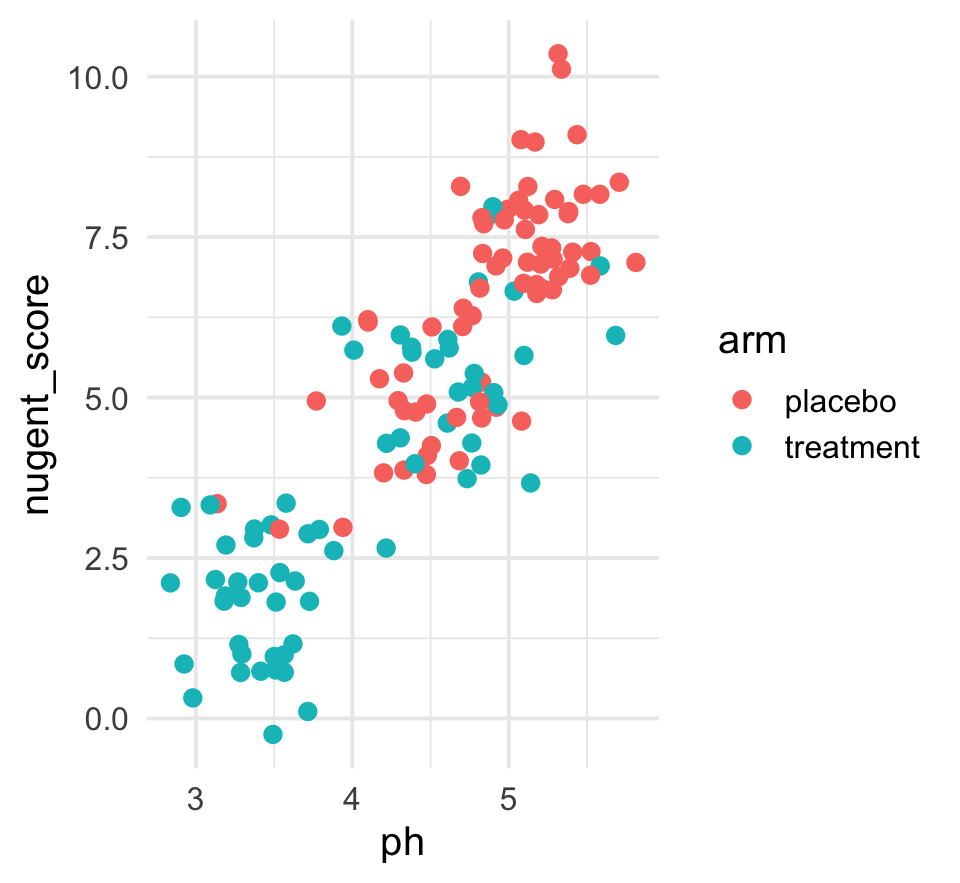
Marks: the coloured dots.
Mappings: ph → x, nugent_score → y, arm → color.
Geom: geom_jitter.
Aesthetic mappings with aes()
aes(x = ph, y = nugent_score) says: each mark’s x position comes from the row’s ph; its y position comes from the row’s nugent_score.
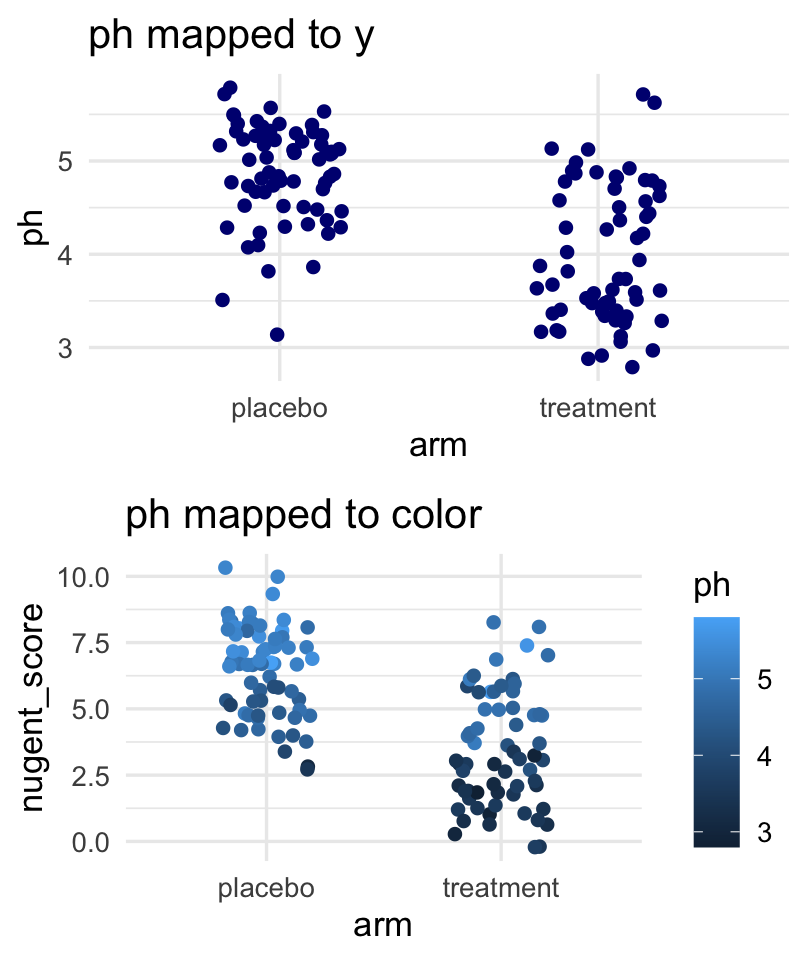
The same column can be shown on different aesthetics — aes(y = ph) or aes(color = ph).
Variable type matches aesthetic
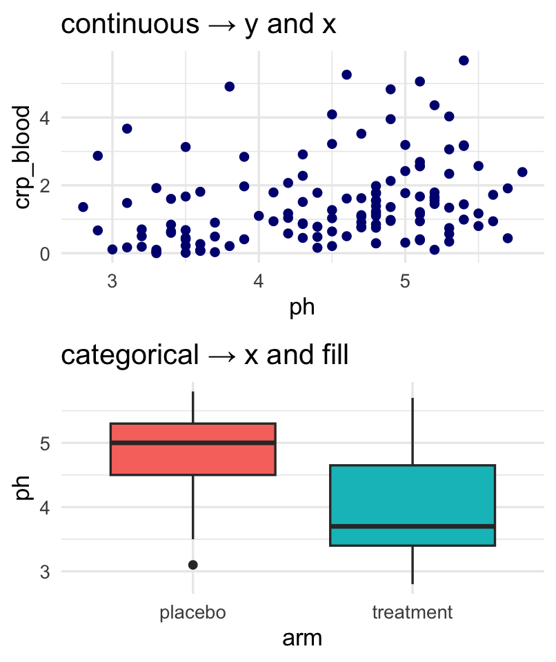
Continuous variables (ph, crp_blood) suit continuous aesthetics: y position, color gradient.
Categorical variables (arm, smoker) suit categorical aesthetics: grouping x, fill, shape.
Common types of mappings
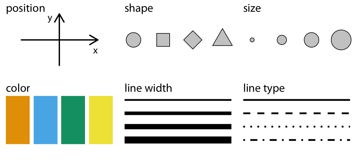
Figure from Claus O. Wilke, Fundamentals of Data Visualization (O’Reilly, 2019).
Each aesthetic is a channel you can map a column to: x position, y position, color, fill, shape, size. The next activity asks you to pick which channel fits which column.
Your first ggplot
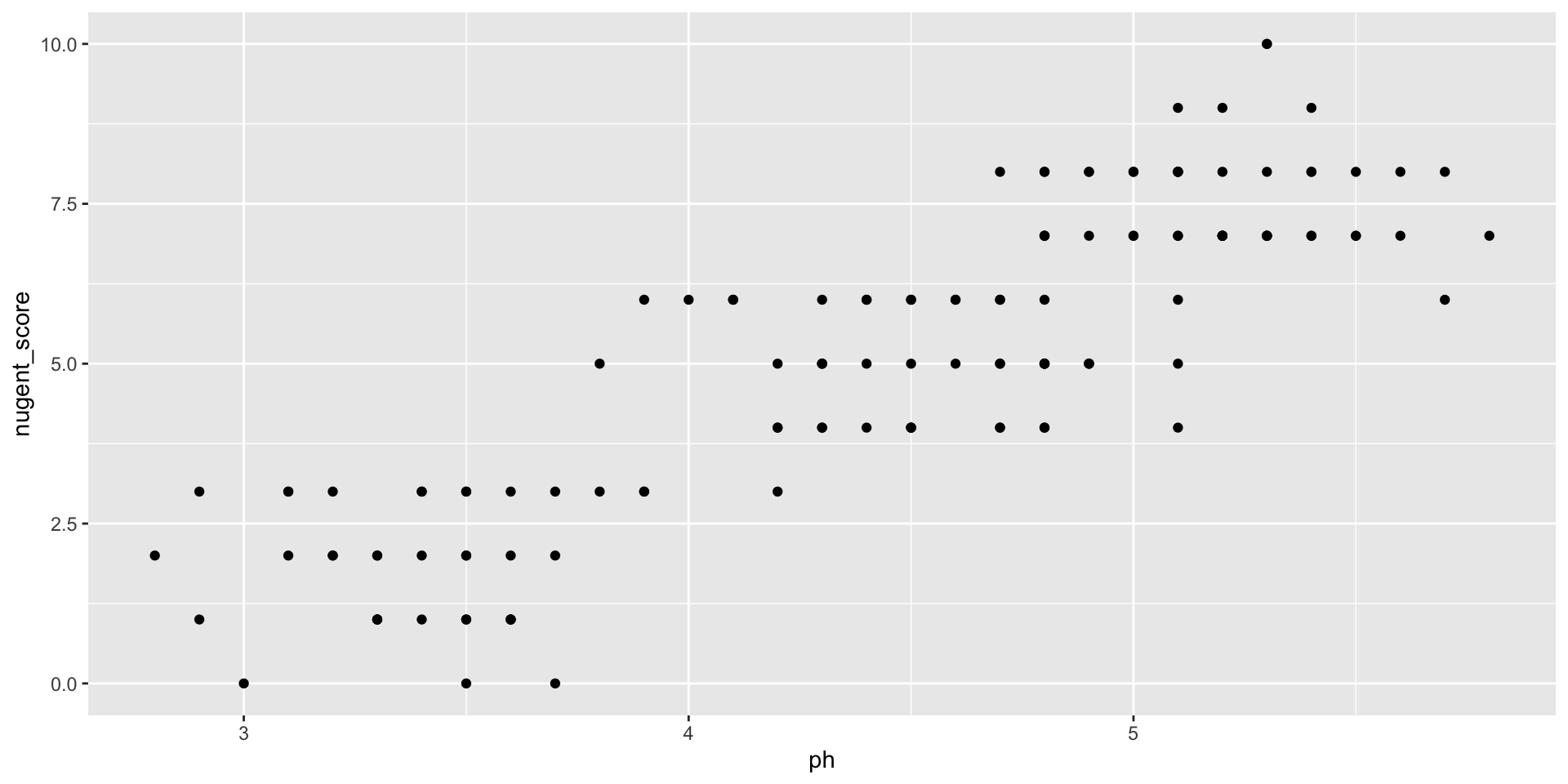
Each row of table_02 becomes one point.
Same mapping, swap geoms
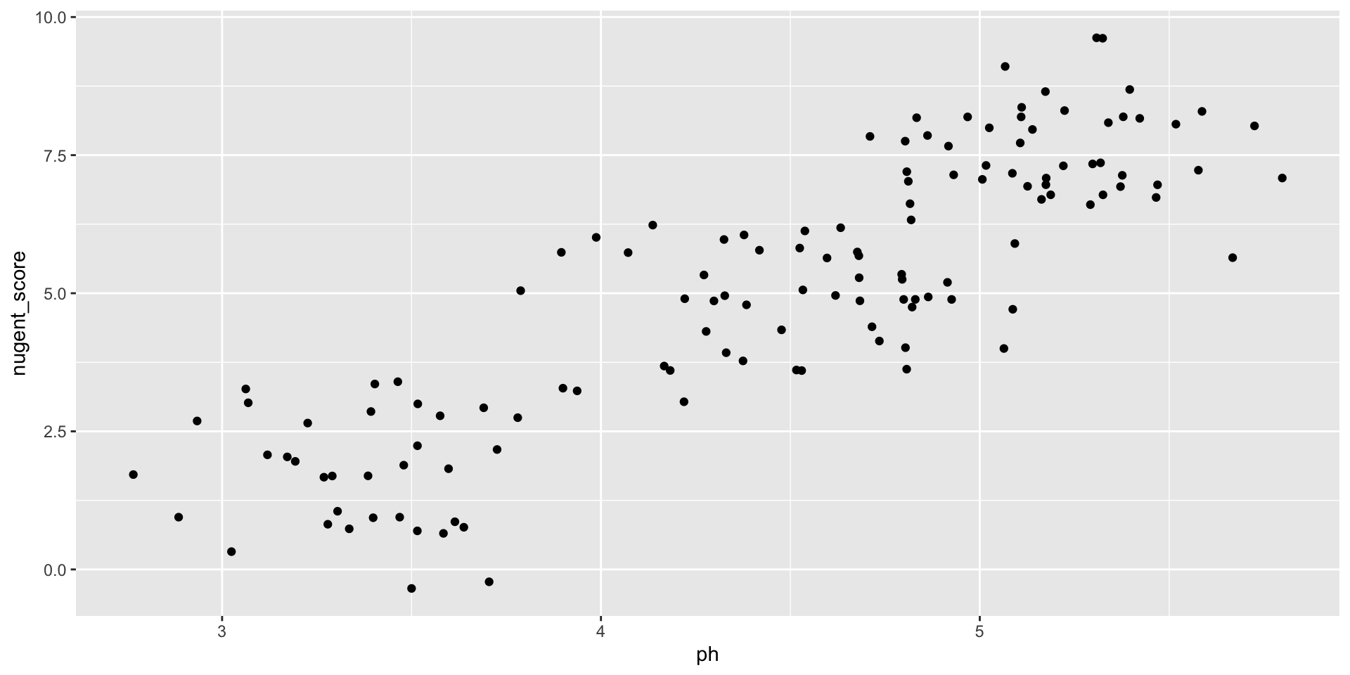
geom_jitter() adds a small random offset — useful for integer-valued nugent_score.
Same x, same y, different mark.
A third aesthetic via color
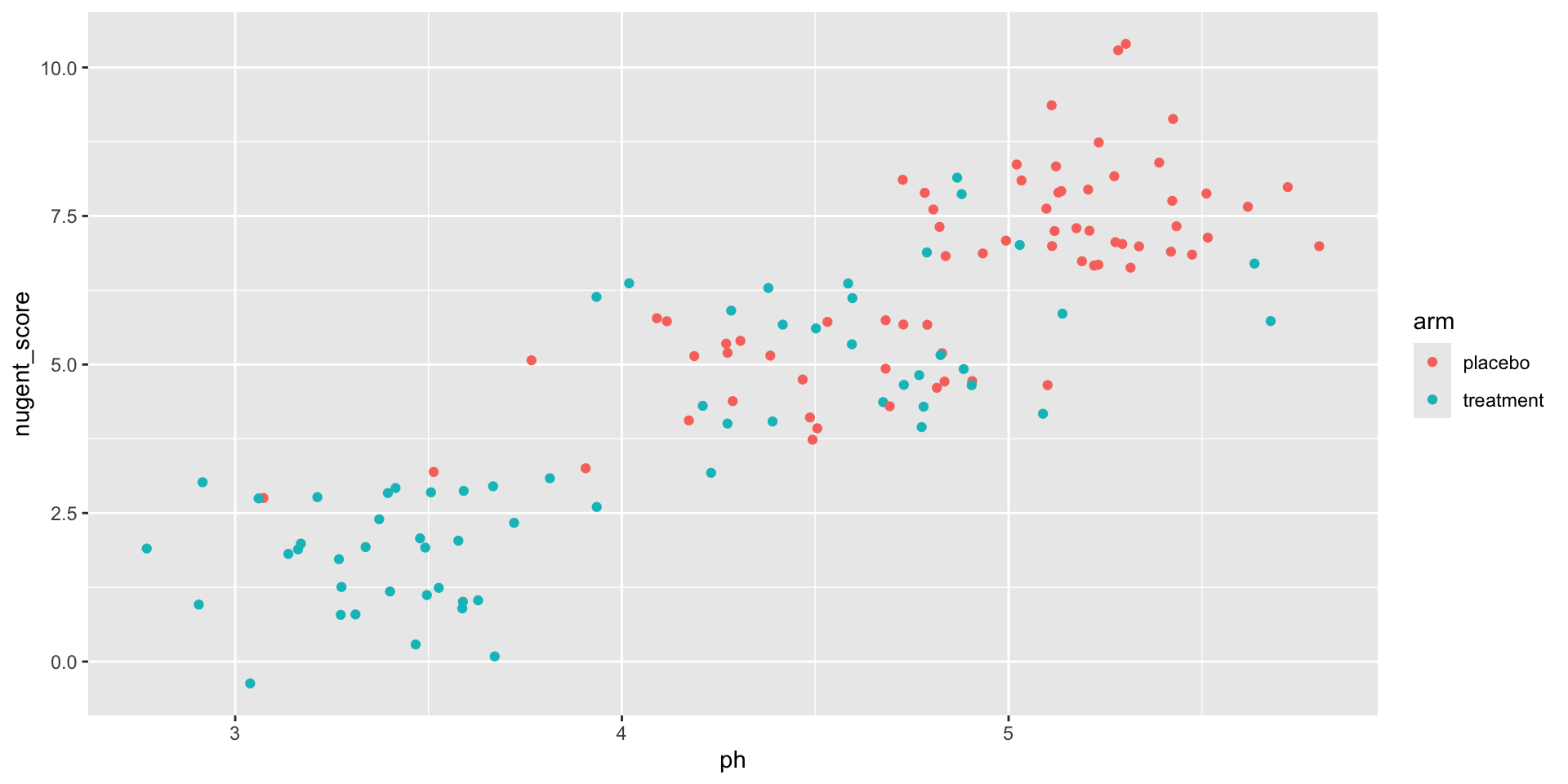
Each mark’s position comes from ph and nugent_score; its color comes from arm.
Different geoms answer different questions
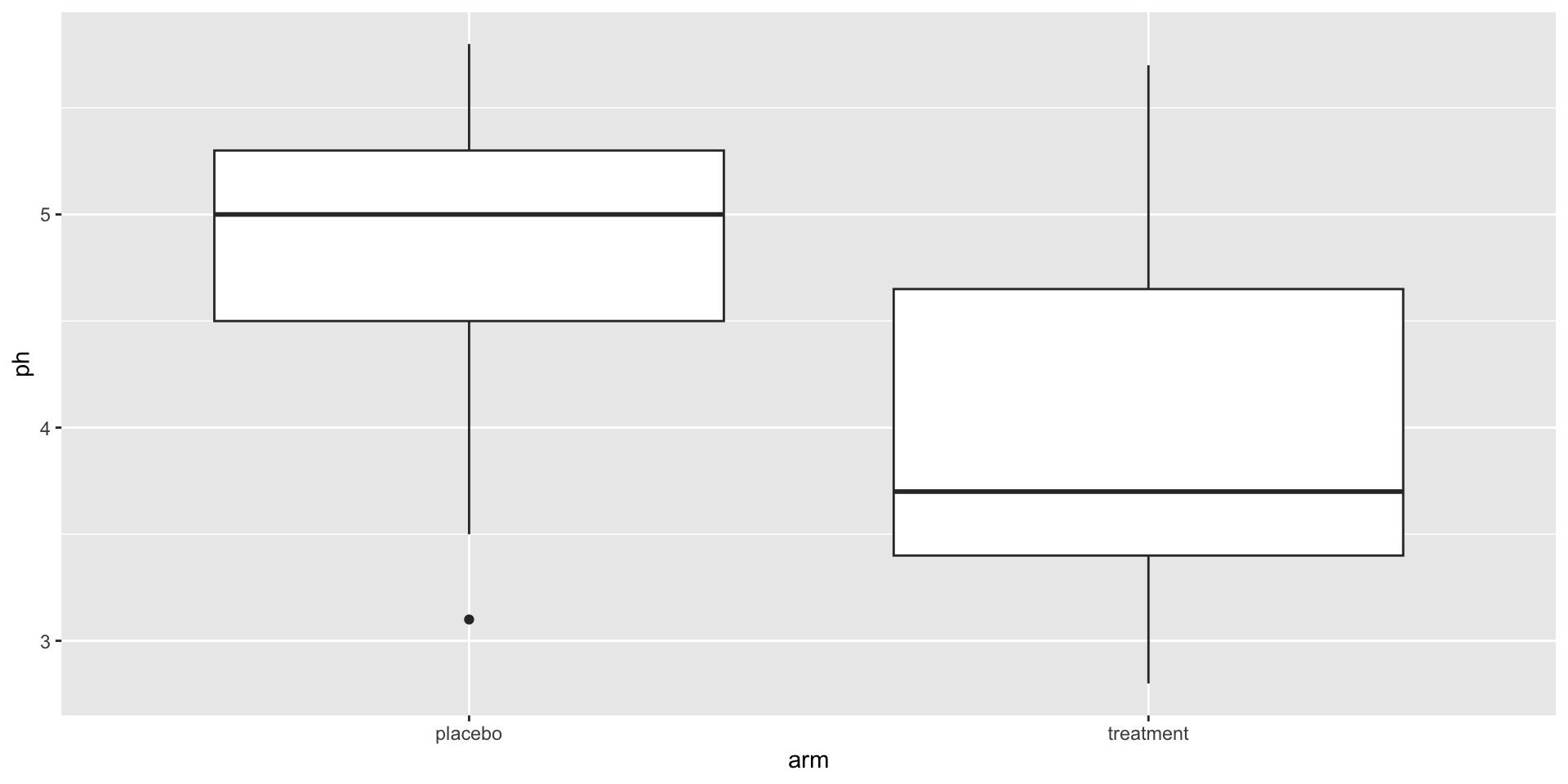
Same data. Now x is categorical (arm).
The mark is a box that summarises many rows. The row-to-mark ratio is not 1:1 — this geom summarises.
color vs fill
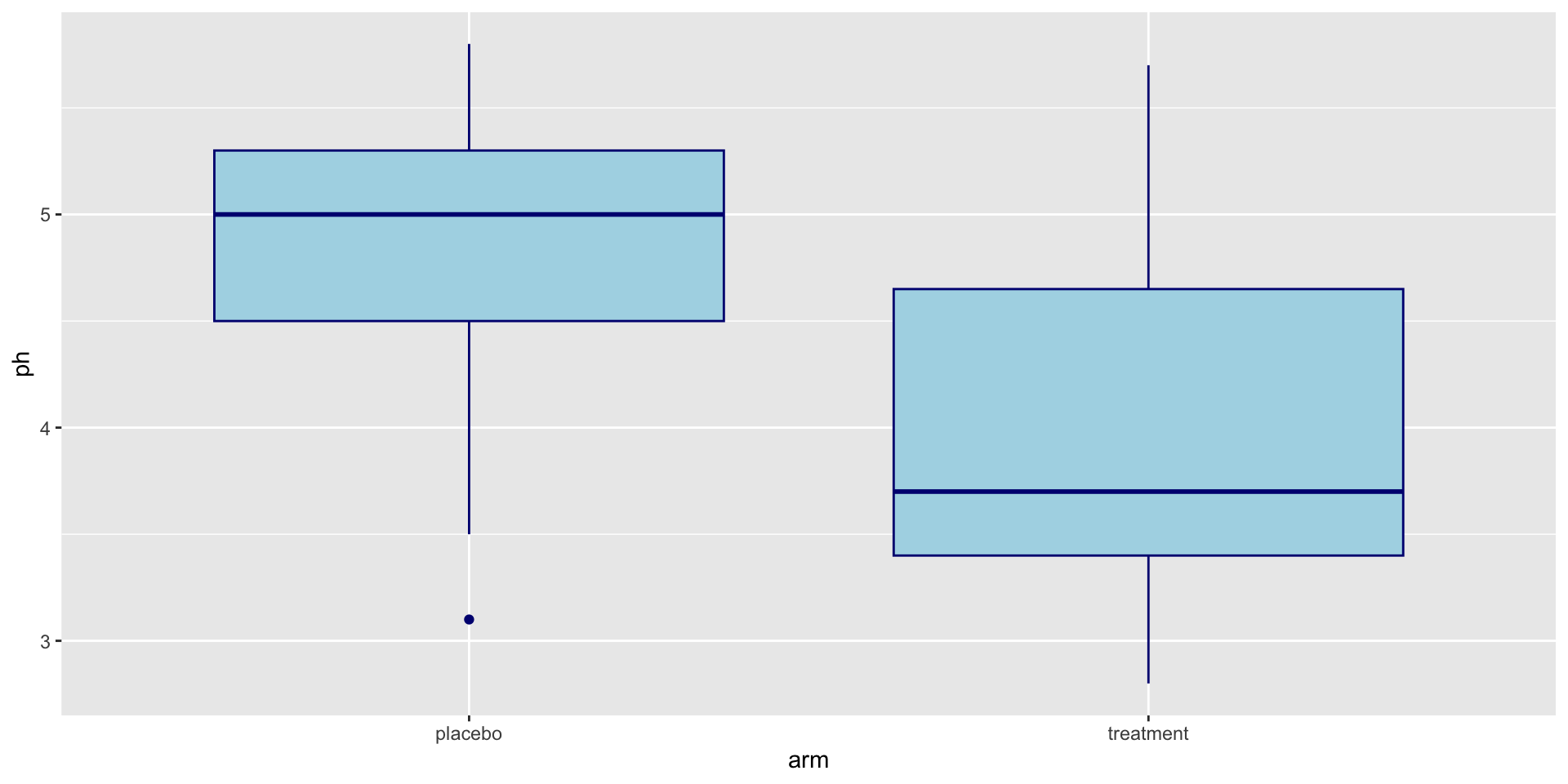
color is the outline. fill is the inside.
Mapping vs parameter
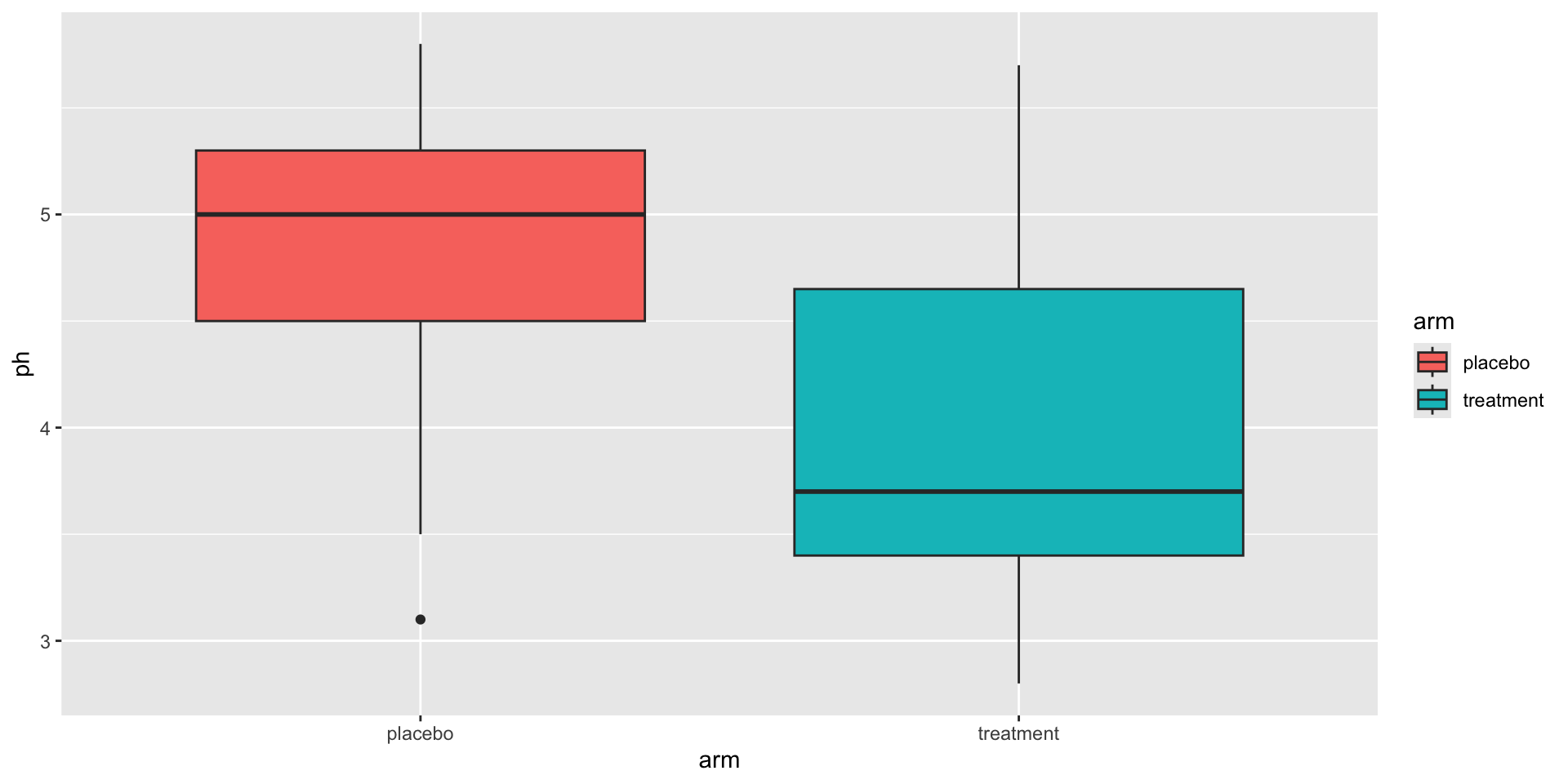
Inside aes() — the fill varies with the data.
Mapping vs parameter
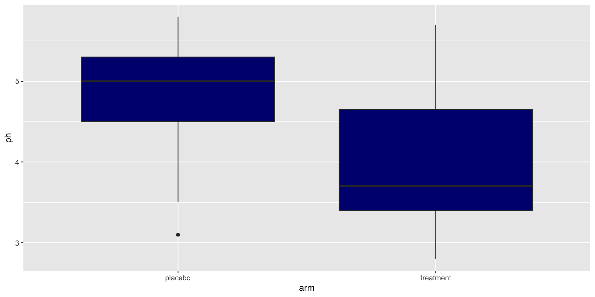
Outside aes() — the fill is one fixed value.
The single most common beginner mistake.
Bar plot from pre-counted data
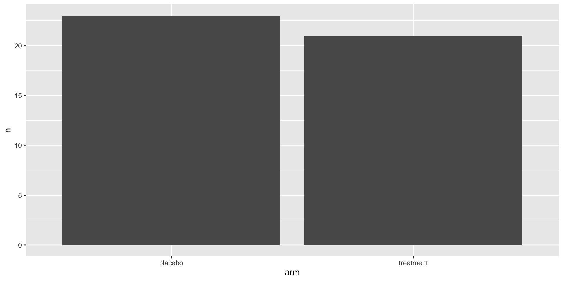
count() returns one row per category. geom_col() draws one bar per row. The row-to-mark ratio is 1:1 again.
We use geom_col instead of geom_bar so the count → bar mapping is explicit.
Axis order is meaning
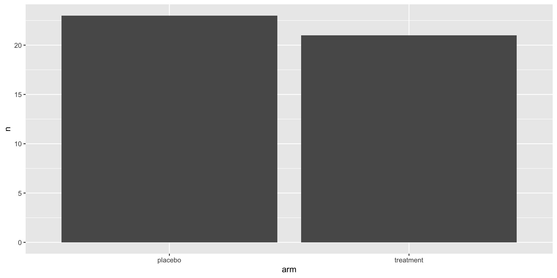
fct_relevel(column, "level1", "level2", ...) sets the order explicitly. Naming "placebo" puts it first; any unnamed level keeps its position after.
R defaults to alphabetical order, which is rarely what you want. Set the order to mean something — control first, baseline first, lowest dose first.
Labels
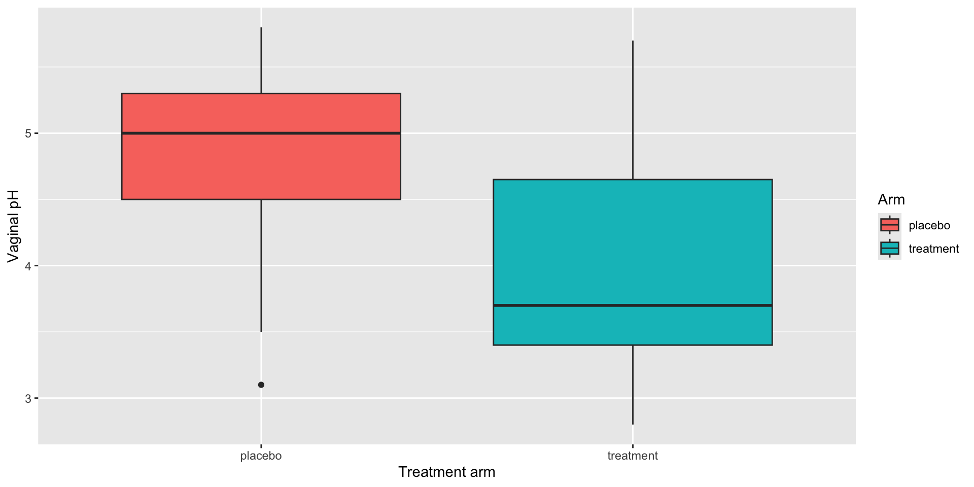
Every published plot needs them.
Facets
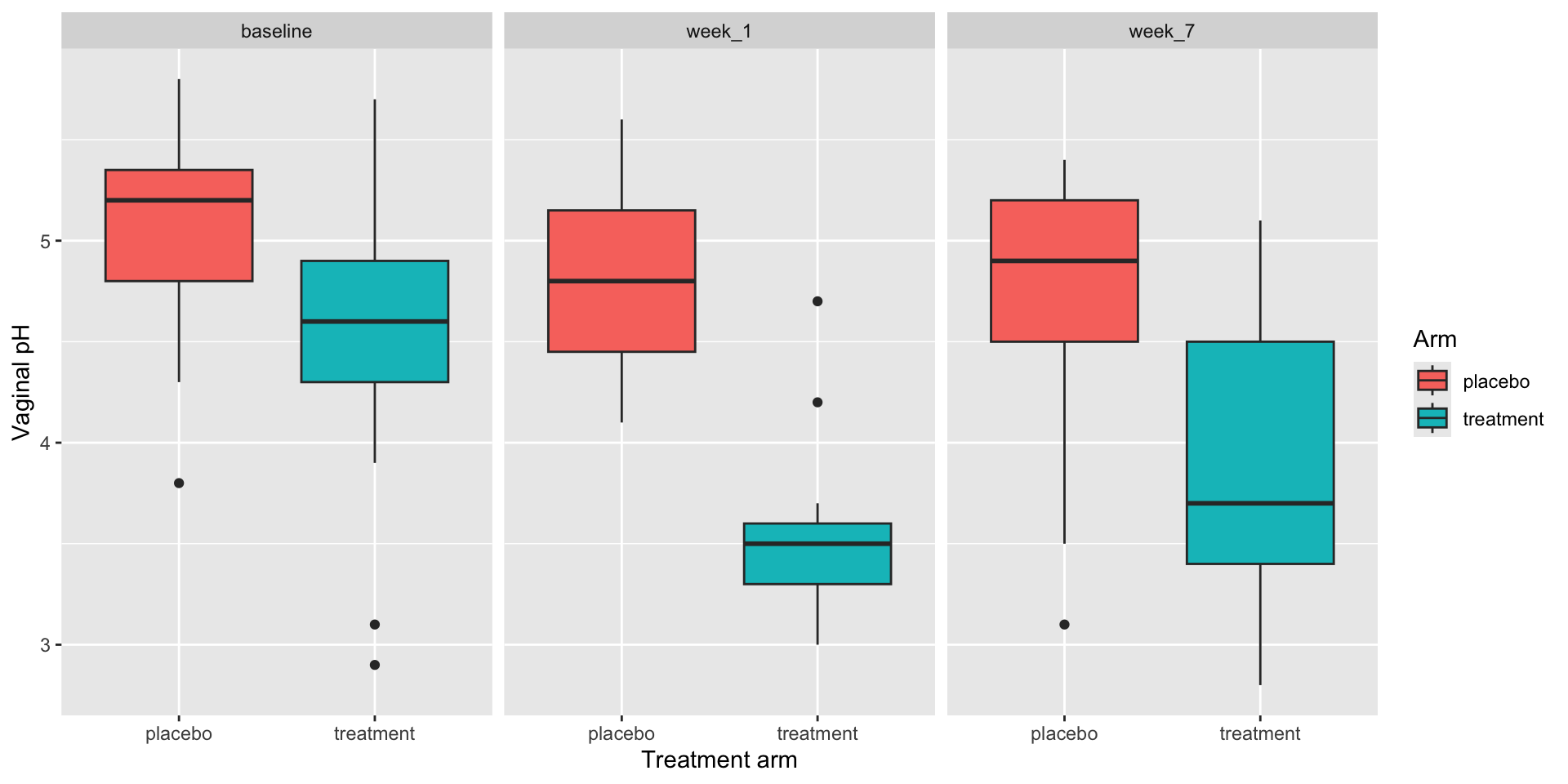
facet_wrap(~ column) splits the plot across panels.
Each row in the data still becomes one mark, placed in its time_point panel.
Let’s take another poll
Go to the event on wooclap